
On this site, a poster is not paper on a wall. It is the two-or-three-word text graphic that lives on a flat green field and gets posted to a story, a feed or a playlist. That means the line is not a caption added to a design — the line is the design. Get the line right and there is nothing else to do; get it wrong and no amount of font tweaking saves it.
This guide is about writing that line. It replaces an earlier version of this article that dressed its advice up in invented statistics and a borrowed-sounding framework. Everything below is mechanics you can test yourself in a browser tab, plus the small number of outside sources that actually say something checkable.
The honest physics of short text
Why does a poster line have to be short? Three reasons, none of which require invented percentages:
- Feeds are scanned, not read. Research on how people read on the web consistently shows users scan for words that match their intent rather than reading word by word — the Nielsen Norman Group’s long-running summary of how little users read is the standard citation. Your line competes with a thumb moving at speed, and it gets one glance.
- Short sentences survive glance-reading. Plain-language guidance — the kind governments use for anything that must be understood on one pass — keeps sentences around fifteen to twenty words, and poster lines live at the extreme end of that: one idea per sentence.
- The field is flat, so word order is the only hierarchy. A normal poster has size, colour and placement to guide the eye; this format has none of that — one flat colour, one type size. Whatever order you put the words in is the emphasis structure, which is why “coffee. gym. regret.” lands differently than “regret. gym. coffee.” The flat field is not a lack of design; it is a design that outsources all hierarchy to your sentence.
- The field does the shouting. On a saturated green background, the type itself is loud. The contrast between black type and that green clears every accessibility tier, which means your words are already at maximum legibility — adding words buys you nothing and costs you the glance.
The anatomy of a line
Nearly every line that works in this format has the same four parts. None of them is about being clever.
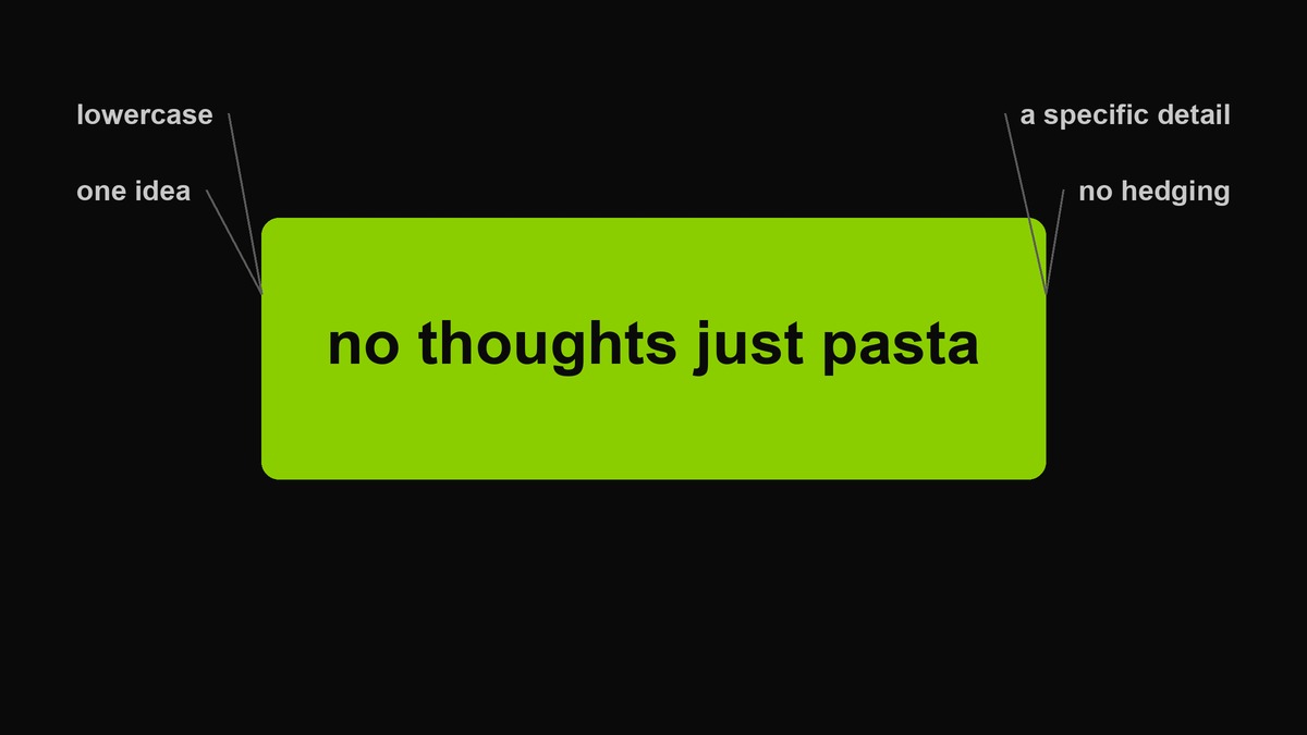 Anatomy of a working line. The example is eight characters of attitude and one very specific carbohydrate.
- Lowercase. Not a style preference — the case removes the sales voice. Capitalised text announces itself; lowercase text mutters, and muttering is what this register does.
- One idea. If a line needs a comma to be understood, it is two lines. Pick the one that carries the post.
- A specific detail. “Just pasta” beats “just food”; “8am” beats “every morning”. Specificity is the only substitute for jokes that actually works.
- No hedging. No kind of, maybe, honestly, just saying. Certainty is performed here, which is why the wrongness reads as confidence.
Ten line shapes that work
These are shapes, not templates — each one describes a different way a short line can land. Every example below is written for this aesthetic: lowercase, specific, no target person.
1. The statement of fact
Deliver an absurd or ordinary truth with total calm. The flatness is the joke.
no thoughts just pasta
gas station flowers hit different
Weaker variant: adding an explanation. The fact does the work; commentary buries it.
2. The question that already knows
A question addressed to nobody, with an obvious answer baked in.
still doing this?
we are not doing this. right?
Weaker: a question that genuinely wonders what the audience thinks. This shape does not ask; it points.
3. The command
Two words, imperative mood, aimed at a situation or at yourself.
be worse
stay unbothered. it is免费的.
Weaker: commands aimed at other people. That is a different genre and it ages badly.
4. The deadline
A time boundary attached to a mood. Works because it borrows urgency from things that actually have deadlines.
until sunday.
till the money runs out.
Weaker: fake urgency about things nobody wants. The deadline has to belong to something real.
5. The number
Numbers imply testimony — someone counted.
3am. again.
day four of being normal
Weaker: round numbers. “5am” is a confession; “early morning” is a brochure.
6. The flip
A before-and-after compressed into one line, or a meaning reversed at the end.
was a gift. now a warning.
Weaker: flips that need a second read to parse. One read, one turn.
7. The borrowed voice
A line someone actually said — a friend, a group chat, a stranger at a station — set down as found text.
she said touch grass. so.
Weaker: invented quotes attributed to nobody in particular. Found text has fingerprints.
8. The list
Three nouns, full stops as drum hits, escalation in the middle.
coffee. gym. regret.
Weaker: lists where the third item stops escalating. The third slot is the whole game.
9. The rhyme, used once a season
Rhyme is memorable and instantly cheap. Ration it.
out of bed. gremlin mode instead.
Weaker: rhyming for a product. The form reads as advertising the moment money is involved.
10. The anti-line
A single word. The most confident shape available, and the easiest to misuse.
soon.
later.
Weaker: single words that are adjectives. Nouns and verbs carry a canvas; adjectives just describe it.
From boring to brat: the three-move repair
Most lines fail in the same three ways, which means most lines can be repaired with the same three moves — in this order, because each move shrinks the line and makes the next one easier.
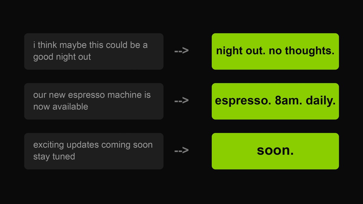 Three repairs, three moves each: cut the hedge, keep the one specific, drop the sales verb.
- Cut the hedge. I think maybe this could be carries no information; delete it and something real is suddenly standing there. Hedges are where courage goes to hide.
- Keep the one specific. Whatever concrete noun survived the cut — the espresso, the 8am, the night out — becomes the spine of the line. If nothing specific survived, the line was never about anything.
- Drop the sales verb. Stay tuned, check it out, don’t miss — these are the register of a poster asking for something. This format never asks. End on the noun.
Length, weight and where the line sits
Once the words exist, three placement decisions change how big they can be. Word count: the working band is two to six words; at eight you are writing a caption, and past ten the type shrinks until the field stops feeling loud. Position: centred vertically reads as a statement; high on the canvas reads as a headline with something hidden below, which is a nice trick when the caption carries the punchline. One line versus two: a two-line cover with a short second line — one word, even — reads as emphasis, like a drum hit after the sentence. Two long balanced lines read as a poem, which is a different genre.
Character count per line matters more than word count for the export: the auto-fit will shrink type to fit, and a line that wraps to three rows at display size has stopped being a poster. Test the wrap before you commit — the preview is honest about this even when you are not.
Worked example, start to finish
One scenario through the whole method, so the moves are visible. The post: you cancelled plans, and you want the graphic to say so without sounding sorry.
First draft, written naturally: I think I might actually cancel tonight, I am just so tired. Nine words, two hedges, one apology, no image in it anywhere.
Move one, cut the hedge: I might actually cancel tonight, I am so tired. Better, still a diary entry. Move two, keep the specific: the only concrete noun is tonight, and so tired is a feeling where a picture should be. Move three, drop the sales verb — here, the apology verb: gone.
Three candidates, shape-tested: cancelling. no notes. (the flip) — funny, slightly mean to the friends, keep for the group chat. tonight is a bed event. (the container) — specific, self-directed, my pick. tired. (the anti-line) — honest but flat; it needs the photo to carry it. The winner is the second one, and it took four minutes, because the moves are mechanical once you have seen them.
The vocabulary problem: words that carry it, words that kill it
Line-level writing lives and dies at the word level, and the register is picky in ways that surprise people. Nouns carry it: objects, places, times and body states — pasta, 8am, the last train, group chat, bed. Verbs survive only in the imperative or the past tense — be, cancel, said. Adjectives are rationed: one per line at most, and it should be a judgment word (feral, unbothered, fine) rather than a decoration word (amazing, incredible, stunning).
The kill list is just as concrete. Marketing verbs — unlock, elevate, discover, level up — belong to the announcer voice. Self-help nouns — journey, growth, healing, mindset — turn any line into a seminar. Intensifiers — very, really, literally, actually — are hedges wearing a costume, with one exception: literally used for something that is not literal has earned its place. And branded words or product names read as advertising instantly; the format was born from an artwork with no product on it at all.
When a line feels dead but you cannot see why, run it against these lists before rewriting it. Nine times out of ten the problem is one word doing marketing work, and deleting it wakes the line up.
The vocabulary problem: words that carry it, words that kill it
Line-level writing lives and dies at the word level, and the register is picky in ways that surprise people. Nouns carry it: objects, places, times and body states – pasta, 8am, the last train, group chat, bed. Verbs survive only in the imperative or the past tense – be, cancel, said. Adjectives are rationed: one per line at most, and it should be a judgment word (feral, unbothered, fine) rather than a decoration word (amazing, incredible, stunning).
The kill list is just as concrete. Marketing verbs – unlock, elevate, discover, level up – belong to the announcer voice. Self-help nouns – journey, growth, healing, mindset – turn any line into a seminar. Intensifiers – very, really, actually – are hedges wearing a costume, with one exception: literally used for something that is not literal has earned its place. And branded words or product names read as advertising instantly; the format was born from an artwork with no product on it at all.
When a line feels dead but you cannot see why, run it against these lists before rewriting it. Nine times out of ten the problem is one word doing marketing work, and deleting it wakes the line up.
Testing a line in thirty seconds
- Say it out loud. If you would not say it to a friend in exactly that tone, it is written, not spoken. This catches most hedge residue instantly.
- The thumbnail test. Export the cover and look at it at 80 pixels wide. A line that needs two glances at thumbnail size is two lines.
- The friend test. Send the bare line to one friend with no context. If the reply is a reaction rather than a question, it works; if they ask what it means, it either needs a rewrite or the in-joke is too deep for the audience you chose.
- The friend test. Send the bare line to one friend with no context. If the reply is a reaction rather than a question, it works; if they ask what it means, it either needs a rewrite or the in-joke is too deep for the audience you chose.
- The any-brand test. Could a bank, a gym chain or an airline post this exact line without changing a word? Then it says nothing and belongs to everyone, which means it belongs to nobody.
Case, punctuation and numbers
Small mechanics, consistently fumbled. Case: all lowercase, including names if you can bear it — capitals reintroduce the announcer. Punctuation: a full stop adds deadpan weight to a flat line; question marks only on genuine questions; exclamation marks never. Numbers: digits, not words — “8am” hits faster than “eight in the morning”, and digits read as testimony rather than description. Em-dashes are allowed exactly once per line, because twice turns any sentence into a definition.
The line between sharp and mean
This register’s edges point at situations, habits, institutions and the self. The moment a line needs a named person to land — their face, their job, their body — it has left comedy and entered something this site will not help you make. The fuller argument, with rewrites that keep the edge while dropping the target, lives in brat humor without harassment. The one-line version: sharp beats cruel anyway; cruel reads insecure within four words.
FAQ
How many words should a poster line be?
Two to six is the working range, with one to three as the power band. Past eight words you are writing a caption, not a line — use the caption generator for those and keep the canvas for the shortest sentence you own.
Should the line and the caption be the same?
No. Put the line on the graphic and say something different underneath — the caption is where the context lives. Duplicating the line wastes the second surface.
Do these shapes work for covers about serious topics?
The shapes are tone-neutral, but this aesthetic is not the right container for grief, politics or anything that deserves nuance. Flat green and lowercase reads as attitude; matching it to a subject that needs care makes the subject look mocked.
Can I reuse a line someone else posted?
A line that escaped into the wild belongs to the format now — that is how these things work, and chasing credit on a nine-word sentence is a losing sport. What is not fine is lifting someone’s page: copying a creator’s distinctive recurring series, their exact caption style or their artwork file. Lines are common property; voices are not.
How do I know my line is trying too hard?
Two reliable symptoms. It needs a comma. Or it needs you nearby to explain it. A working line survives being pasted somewhere with no author attached.
Can I reuse a line someone else posted?
A line that escaped into the wild belongs to the format now – that is how these things work, and chasing credit on a nine-word sentence is a losing sport. What is not fine is lifting someone’s page: copying a creator’s distinctive recurring series, their exact caption style or their artwork file. Lines are common property; voices are not.
How do I know my line is trying too hard?
Two reliable symptoms. It needs a comma. Or it needs you nearby to explain it. A working line survives being pasted somewhere with no author attached.
Why lowercase? Is that just branding?
It is both. The album cover that made this look famous ran its one word lowercase, and the case carried meaning: nothing is being announced, so nothing is capitalised. Every tool on this site keeps it that way.
Sources
- Nielsen Norman Group — how little do users read (scanning behaviour and word-count attention research).
- PlainLanguage.gov — short sentences and one idea per sentence, from the US plain-language guidelines.
- W3C — WCAG contrast minimum, the standard behind the black-on-green legibility claims.
Where this article offers a judgment — which line shapes feel stronger, when rhyme reads as advertising — it is labelled as judgment and you should test it against your own feed. Percentage claims you may have seen elsewhere about captions and clicks are mostly unsourced; this page does not repeat them. This site is independent and unaffiliated with any artist or label.
[…] Is this the same voice as the poster line guide? […]
[…] run the same shape three times. Two questions in a row is a pattern; three is a tic. The ten shapes exist so you can […]
[…] on this site: the ten line shapes all work inside these boundaries, and the three dials explain why the in-bounds versions still feel […]
[…] on this site: the palette guide for colour systems, the poster line guide for the words themselves, and the platform sizing guide for exporting either style at the right […]
[…] 200 lines are original to this site. Related: the poster line guide for writing your own, the seven-pass method for turning a real sentence into one of these, and the […]
[…] the poster line guide for the words, the platform guide for sizes and cropping, and the tools index for everything else […]
[…] scene with more lines, the template maker gives you the portrait ratio for story tiles, and the poster line guide covers writing your […]