
This is the whole manual for the generator on the homepage — every control, what it actually changes, and the twelve things worth making with it. The tool has four inputs and two buttons, which is the point: the format is one flat field and one short line, and anything more would be a different product.
Everything below describes the tool as it exists today. Where a limit is hard — the 32-character ceiling, the three canvas sizes — it is stated as a limit rather than smoothed over, because knowing the edges is most of using it well.
Start with what the tool is for
The generator makes one object: a flat field with a short line of text on it, exported as a PNG. That is the whole product, and understanding it as a constraint rather than a limitation is what makes the settings easy. The reference artwork this format comes from has a single word on a single colour, and every control on this page exists to let you put your word in that position — not to let you design a poster.
Which means the correct workflow is almost always: write the line first, then touch the tool. People who open the generator with an empty text field end up adjusting sliders until something looks interesting, which is a slow way to arrive at a picture of a sentence nobody would say. Write the sentence, cut it to something you could fit in 32 characters, then come and set four values.
There is also a second, smaller control at the top of the page: a preview field with its own update button. It is a demonstration, not a second tool — it shows the style reacting to a short phrase so you know what you are getting before you scroll to the tool area. The export comes from the controls below it, not from the preview card. If something looks wrong in the preview, ignore it and check the real canvas.
The five controls, exactly
| Control | What it is | Range | Default |
|---|---|---|---|
| Your text | the line on the canvas | 32 characters maximum | “brat” |
| Style | field and ink pairing | Classic Green, White Mode | Classic Green |
| Text size | type size in pixels | 36 to 140 | 92 |
| Canvas size | export dimensions | 1500×1500, 1200×1500, 1500×1000 | Square |
| Reset / Download PNG | clears the fields; exports the canvas | — | — |
That is the entire interface. There is no font picker, no colour wheel and no layer panel, and their absence is a design decision rather than a missing feature — the reference artwork has one word on one field, and a tool that offered forty typefaces would be selling something else.
Five settings worth memorising
| Job | Canvas | Size | Style | Why |
|---|---|---|---|---|
| Profile picture | Square | 110–140 | either | shown at 40–100 px; the word must survive the shrink |
| Feed post | Square | 80–100 | Classic Green | the loudest option in a grid of neutral photos |
| Story cover | Portrait | 90–110 | Classic Green | full-screen on a phone; keep the line in the middle third |
| Link preview | Landscape | 60–80 | White Mode | rendered at ~320 px inside a card; short and hard-edged |
| Document or slide | Landscape | 70–90 | White Mode | sits on a white page without shouting over the text |
These are starting points, not rules. The one that should be treated as a rule is the landscape size range: at 1500 × 1000 the height budget is a third smaller than the square, so a size that looks confident on one canvas looks timid on the other, and link previews are the surface where the mistake is most visible.
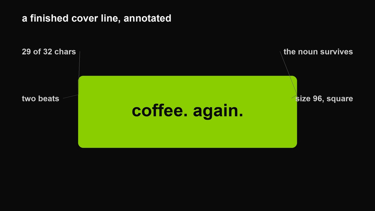 A finished line with the four decisions marked. Every cover this tool makes should pass these.
The 32-character ceiling, and what to do about it
The text field stops you at 32 characters, and that limit is the most useful thing about the tool. Thirty-two characters is roughly five or six words at poster weight — which is exactly the length where a line still reads as a stance rather than as a sentence. Longer and you are writing a caption; the canvas is the wrong surface for that.
When the limit bites, do not fight it by shrinking the type. Cut words. The standard reductions all improve the result: drop the article, drop the pronoun, drop the feeling-adjective and keep the noun. i cannot believe how good the coffee was becomes coffee. again. — shorter, and twice as good.
If the message genuinely needs more than 32 characters, the format is wrong for it. Put the long version in the caption and let the image carry the shortest possible form of the same thought.
Classic Green versus White Mode
Classic Green is the reference: acid field, black type. It is the louder of the two and the only one that is instantly recognisable as this thing. Use it when the goal is to be noticed in a feed, and remember the pairing rule — black on green clears every accessibility threshold, so the words stay readable at sizes where the colour would otherwise do all the work.
White Mode inverts to a pale field with dark type. It is calmer, prints better, and disappears faster in a dark-themed app. Reach for it when the surrounding design is light — a document, a slide deck, a website with a white background — or when the green would be shouting in a context that does not want shouting.
There is no custom colour picker, which surprises people. The two modes are the whole identity; a field you can tint any colour stops being a reference and becomes a background. For custom colours the template maker has six fields and five ratios, and the green page gives you the exact values if you are building something elsewhere.
What the text size slider actually does
The slider sets the type size in pixels between 36 and 140, and it does not auto-fit to the canvas. That single fact explains most disappointing exports: at the default 92 on a 1500-pixel square, a short word looks enormous and a long line looks small and lost. The size is absolute; the canvas is not.
Working rule: set the canvas first, then the size. On the square, 92 to 110 suits two or three words and 60 to 80 suits five or six. On the landscape, drop about a third — the height budget is smaller and the line has more width to run out of. On the portrait, you can go larger than feels correct, because it will be viewed full-screen on a phone.
And check the export, not the preview. The preview is scaled to fit the page; the file is 1500 pixels wide and will be viewed at a fraction of that. Zoom out before you download.
Choosing a canvas
| Canvas | Pixels | Best for | Watch out |
|---|---|---|---|
| Square | 1500 × 1500 | feed grid, profile art, anything reused across platforms | nothing crops it, which is why it is the safe default |
| Portrait | 1200 × 1500 | story tiles and posters where the grid shows a square | keep the words in the vertical middle or the grid crops them |
| Landscape | 1500 × 1000 | link previews, video thumbnails, slide headers | seen very small — short line, larger type, no blur |
The full ratio logic, including safe zones and how platforms compress flat colour, is in the platform guide. The short version: square survives everywhere, the other two are better where they fit and worse everywhere else.
A worked session, ninety seconds
One real example, end to end. The thought: a photo of a table after dinner, four people, nothing left but plates and one drink.
Step one, write it normally: we stayed at the table for ages after the food arrived — 58 characters, one clause too many, and the interesting part is at the end. Step two, cut to the noun and the time: the food went cold. nobody left. — 29 characters, inside the limit, two beats. Step three, settings: square canvas, size 96, Classic Green. Step four, check the export at thumbnail size — both lines read, so leave the size alone. Step five, download.
Total time about ninety seconds, and the only hard part was step two, which happens before you touch the tool. That ratio is typical: the generator is fast, the editing is the work.
The download step
Download PNG exports the canvas at its full pixel size, named from your text. PNG rather than JPEG matters here more than you would expect: a flat saturated field with high-contrast black letterforms is close to the worst case for JPEG, which rings the boundary between ink and field with visible artefacts. PNG keeps that edge clean and, on a flat image, does not cost much more.
Before you close the tab, check three things at actual size: the line is inside the outer tenth of the canvas, the type is legible when the image is shrunk to thumbnail, and nothing important sits where an app will overlay its own interface.
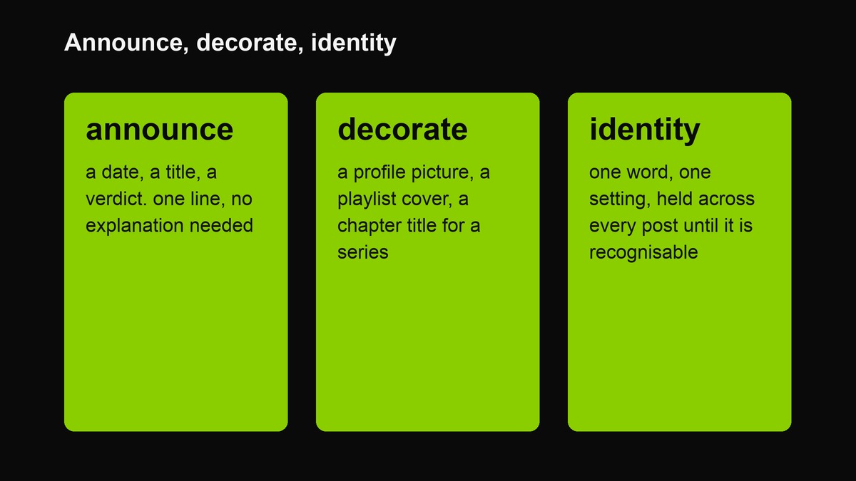 Three jobs the tool is actually good at. Knowing which one you are doing settles most of the settings for you.
Twelve things to make with it
- A profile picture. One word, square, size 110 or above, White Mode if your other images are dark.
- An album cover for a playlist. Name the playlist, four words maximum, square.
- A story cover. Portrait canvas, line in the middle third so the grid tile keeps it.
- A date announcement. friday. 8pm. Nothing else on the canvas.
- A mood line. Take one from the 200-caption deck and swap one detail.
- A chapter title for a series. Same settings every time; only the words change.
- A link-preview image. Landscape, three words, no blur — it will be shown at 320 pixels.
- A sticker for a document. White Mode, then remove the field in an editor if you need the word alone.
- A protest sign for one sentence you believe. Square, size 140, four words.
- A bookclub or club badge. One word, White Mode, and hold it across every post.
- A reply to a group argument. no. Genuinely effective, occasionally fatal.
- An exercise in editing. Write what you want to say, then cut it to 32 characters. The exercise is the point; the image is a by-product.
What the tool deliberately does not do
It is worth naming the absences, because each one is a decision someone made: no custom colours, no font choice, no upload of your own image, no transparent background, no text larger than 32 characters, no watermark and no account. The first five are the format protecting itself — a generator that let you pick any colour would be a background app with a nostalgic name attached. The last two are the business model: the site is ad-supported, so the tool is free and the outputs are yours, and there is no account because there is nothing worth attaching one to.
If you find yourself wanting the missing features, you do not want a better version of this tool — you want a different one, and the tools index has the nine that cover those jobs.
When this is the wrong tool
If you need a specific ratio, more than one line of text, a colour other than the two modes, or a transparent background, the generator is the wrong instrument — and each of those has a purpose-built tool on this site. The template maker handles five ratios, four styles and six fields. The sticker maker exports transparent PNGs with outline and tilt. The font and logo tool is the one for a heavier wordmark with real blur control. Using the wrong one produces a compromise image; using the right one takes the same thirty seconds.
How it works, and what it does not do
The canvas is drawn by your browser. Your text never leaves the device — there is no upload step, no server-side rendering, no queue, and no account to attach it to. Nothing you type is stored, logged or recoverable by anyone, including us. It works offline once the page is loaded, which is also why it is fast and why it will never be rate-limited.
Writing about the trip after you are home
The best travel lines are written on the return journey, not during it. Two reasons. First, memory has already done the editing: by the time you are on the train to the airport you have forgotten the four hundred indifferent minutes and kept the eleven strange ones, and those eleven are exactly what a 32-character line can hold. Second, the irony only works retrospectively — a line about the disaster writes itself badly while the disaster is happening, because you are still inside the feeling the format refuses to express.
So: photograph during the trip, write afterwards, and let the gap do the selection. The lines that come out of that process are specific without being sentimental, which is the only combination this register can carry.
The three-post arc, and why not more
A trip is best told in three covers, and the reason is not restraint for its own sake — it is that three is the number at which a sequence becomes a story. Arrival: the disorientation post, the airport, the first wrong turn, the room before you have unpacked. Middle: the one that could only have happened on day four, when the plan has already collapsed and you are operating on local knowledge. Departure: the taxi at an unreasonable hour, the last coffee, the flatness of going home.
Four or five posts dilute the arc; ten turn a trip into a live blog and make every individual line weaker, because the audience stops looking for the point. And all three should be posted after you are home, which solves the privacy problem and improves the writing, because the memory has already started selecting — the same selection your audience needs you to do for them.
Before you start: the two decisions
Everything else follows from these. One: what the line says. Write it, cut it to something inside 32 characters, and do not touch a slider until it is finished. Two: where it will be seen, because that sets the canvas and the size before you have chosen anything aesthetic. Get those two right and the remaining controls are housekeeping; get them wrong and no amount of adjusting will rescue the export.
FAQ
Why will it not accept my full sentence?
Because 32 characters is the format, not a bug. The reference artwork carries one word. A tool that accepted a paragraph would produce a poster nobody reads, and the limit is what forces the editing that makes the result good.
Can I change the font?
No — the type is fixed by design, and the two styles are the whole vocabulary. If you want a different typographic treatment, the font and logo tool gives you a wordmark with a blur control, which is the closest legitimate variation.
Why does my export look smaller than the preview?
The preview is scaled down to fit the page; the file is 1500 pixels on its long edge. Open the file at 100 per cent before judging, and shrink it to thumbnail size to test legibility, which is how it will actually be seen.
Does it work on a phone?
Yes, including the download. The text-size slider is the fiddliest control on a small screen; set the canvas and style first, then nudge the size in a few steps.
Is there a limit on downloads?
No. There is no account, no counter and no watermark. The only cost the site takes is that it is ad-supported, which is why it stays free rather than why it would ever stop.
Related: the poster line guide for the words, the platform guide for sizes and cropping, and the tools index for everything else on the site.