
EXAMPLES & GALLERY
Every output these tools make, with its settings attached
Every image on this page was produced by a tool on this site, in the browser, with no post-processing. Under each one is the actual parameter set used — colour values, type size, density, outline weight — so you can reproduce it or deliberately change one thing and see what breaks. This is not a mood board of things that look nice; it is a specification with pictures attached.
Two things worth saying before you scroll. First, these are my examples, not submissions: nothing here came from another person’s account, and nothing here is a stock image. Second, the point of showing parameters is that the format rewards constraint, and you learn that faster from seeing what a size does to a canvas than from reading advice about it.
Covers
Made with the generator. Field colour, ink and the auto-shrink rule are the tool’s own — the caption under each one states the size it settled at.
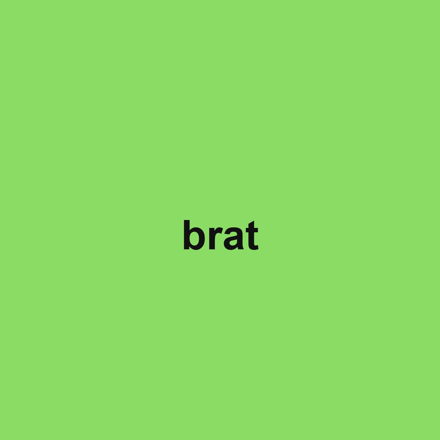 field #8bdc65, ink #111111, Arial lowercase, 140px
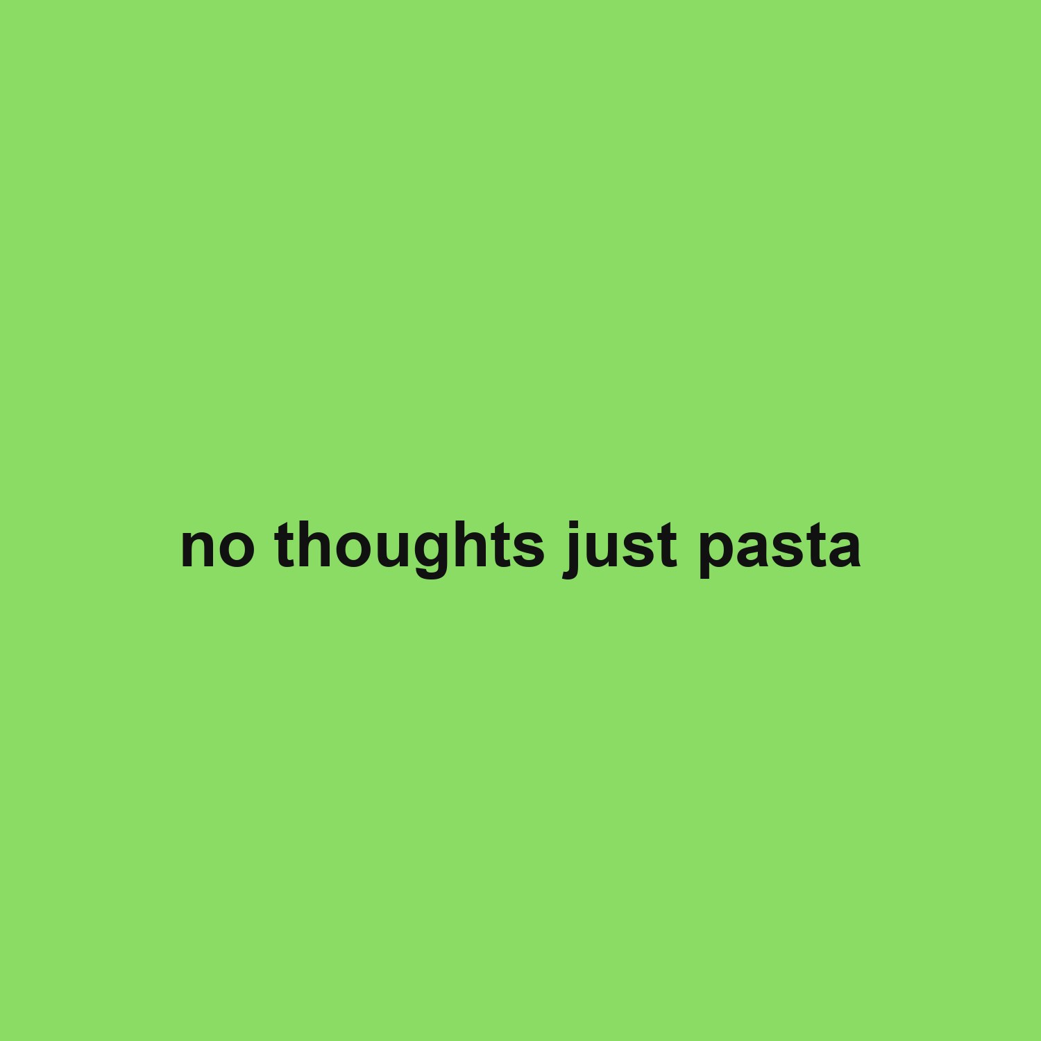 field #8bdc65, ink #111111, Arial lowercase, 92px
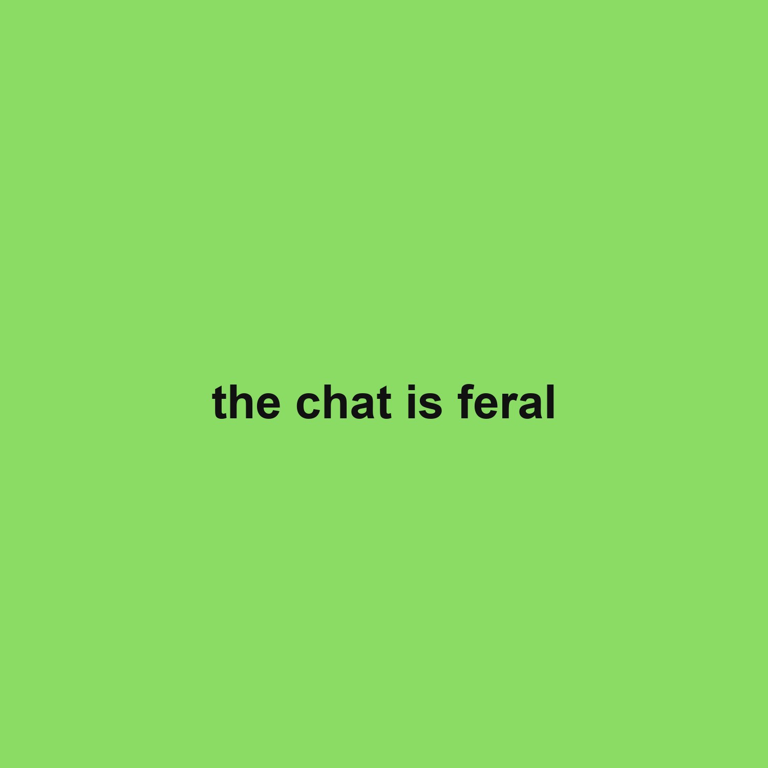 field #8bdc65, ink #111111, Arial lowercase, 92px
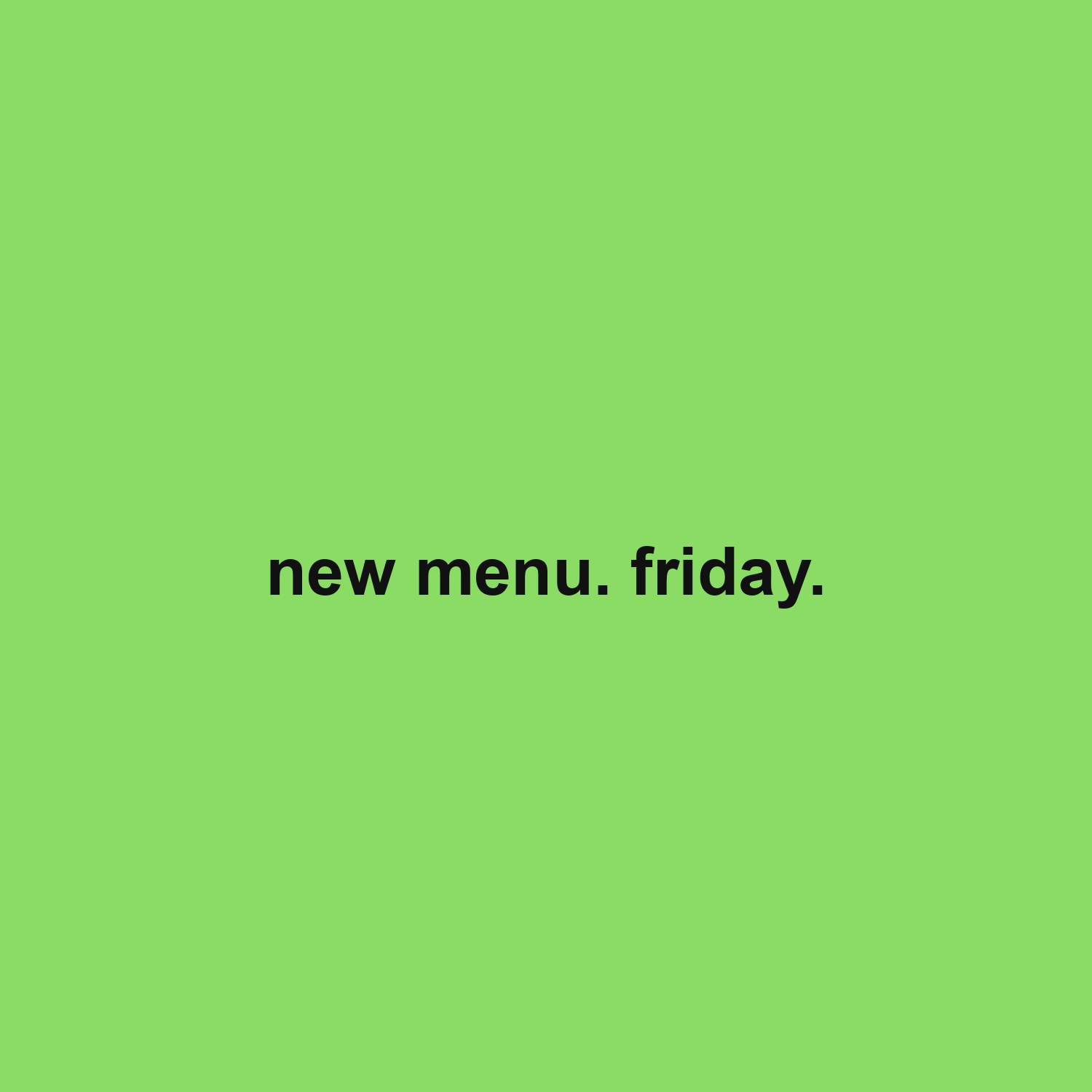 field #8bdc65, ink #111111, Arial lowercase, 92px
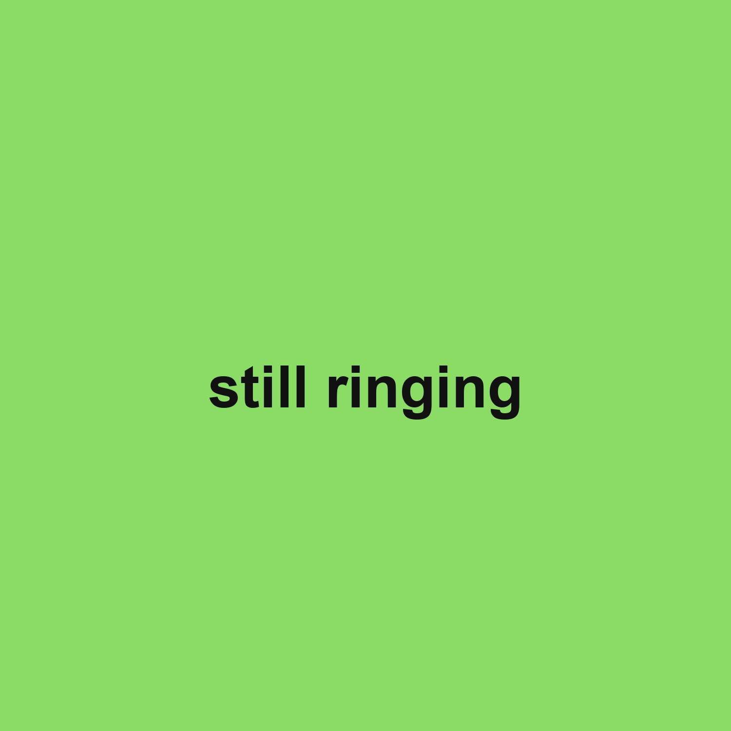 field #8bdc65, ink #111111, Arial lowercase, 120px
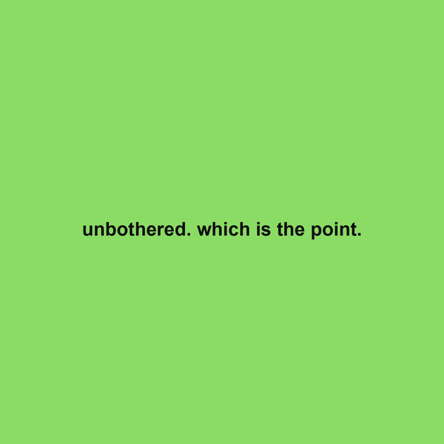 field #8bdc65, ink #111111, Arial lowercase, 64px
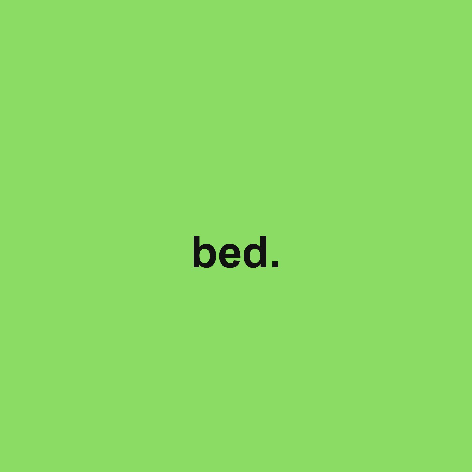 field #8bdc65, ink #111111, Arial lowercase, 140px
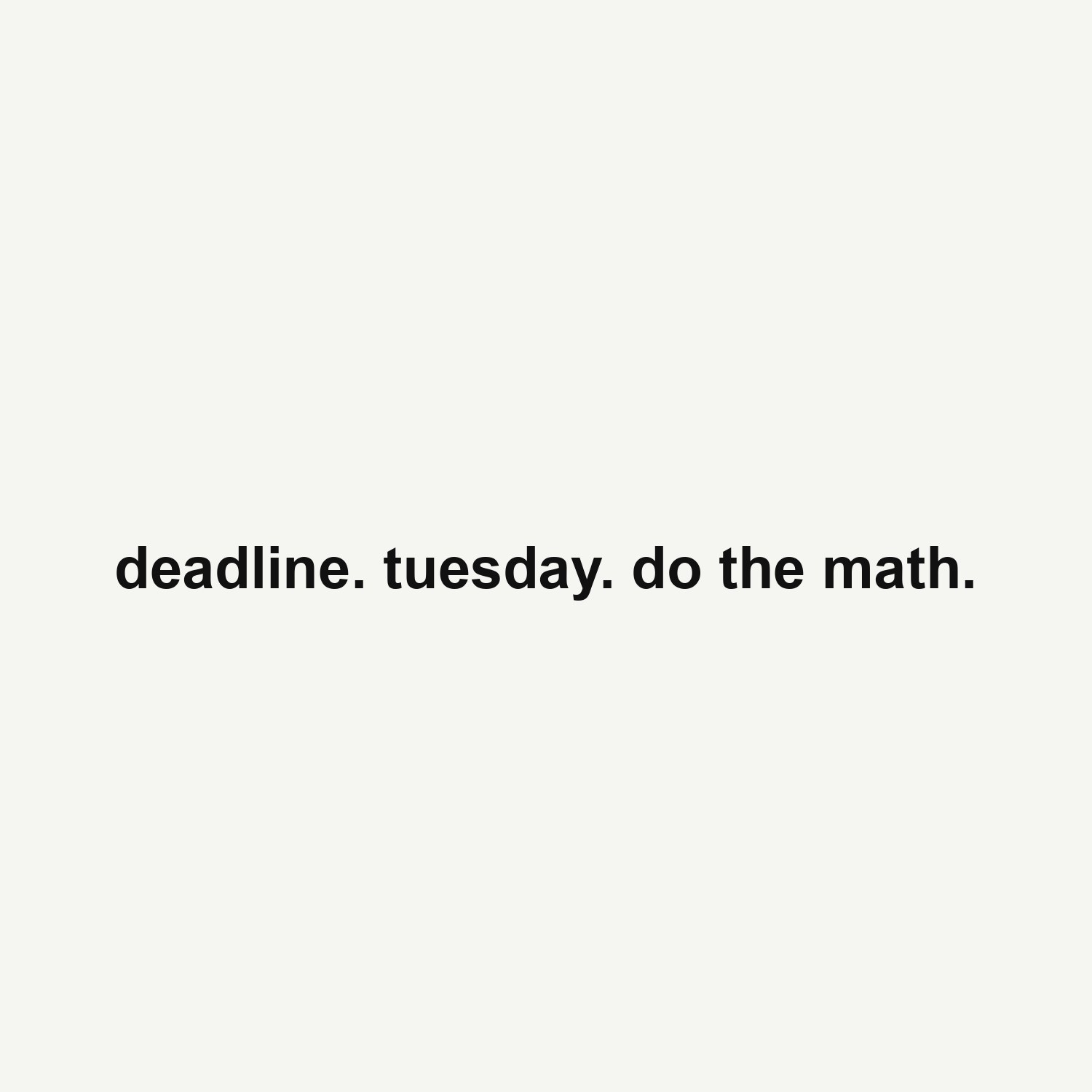 field #f5f5f2, ink #111111, Arial lowercase, 80px
Walls
Made with the wall generator: one word tiled, alternate rows offset half a step and rotated slightly so the grid reads as a pattern rather than a table.
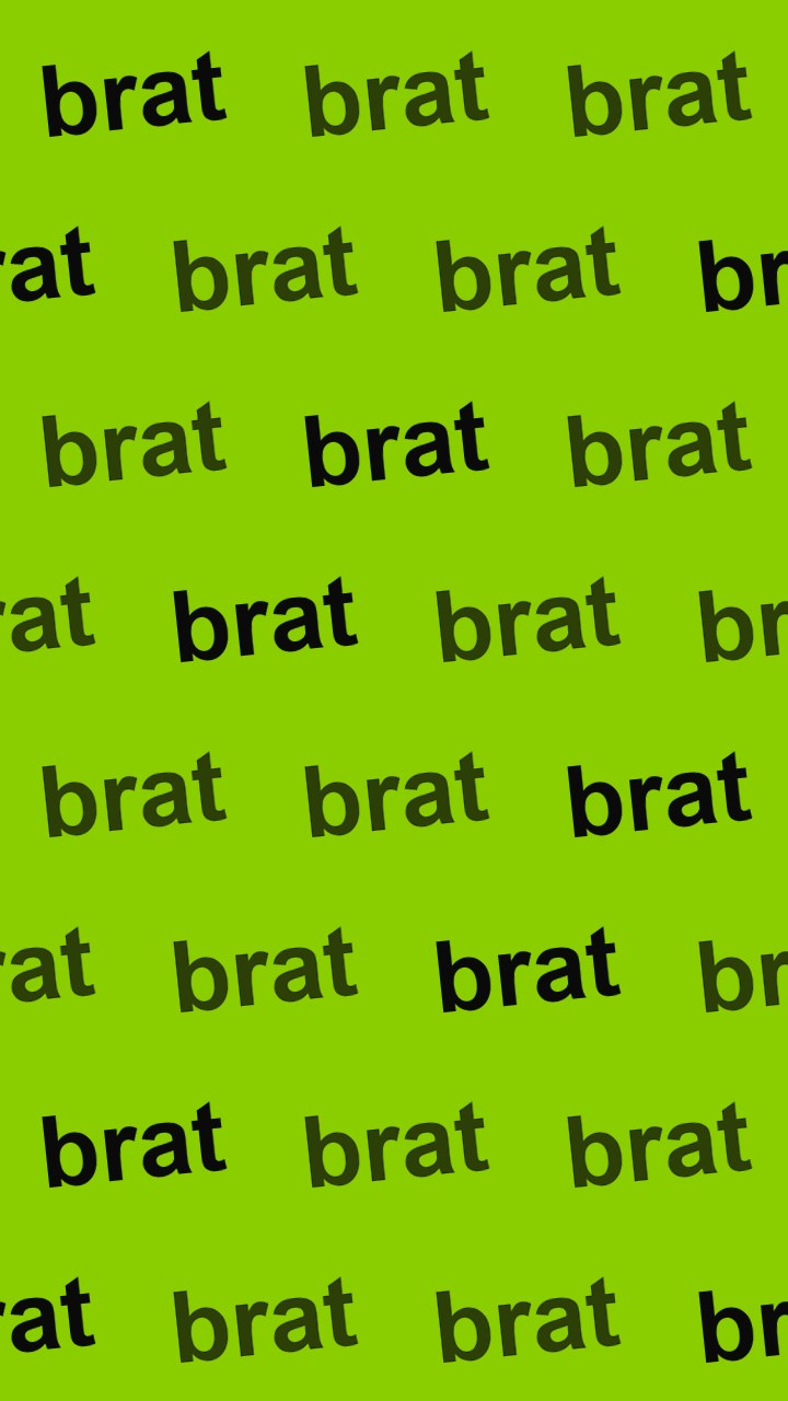 field #8ACE00, 3 columns x 8 rows, solid finish
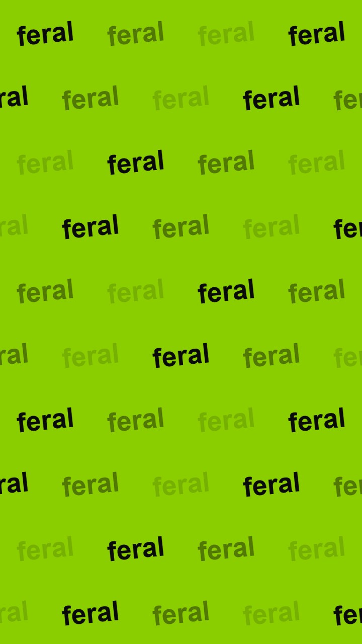 field #8ACE00, 4 columns x 10 rows, mixed finish
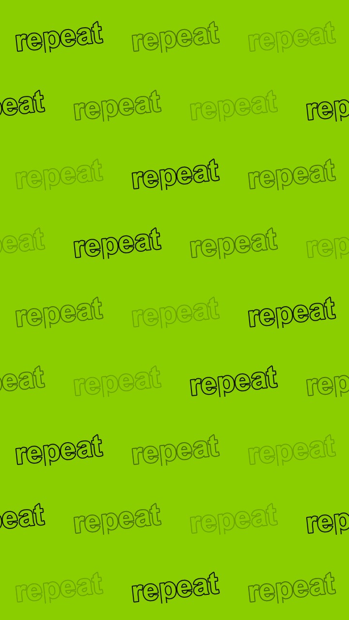 field #8ACE00, 3 columns x 9 rows, outline finish
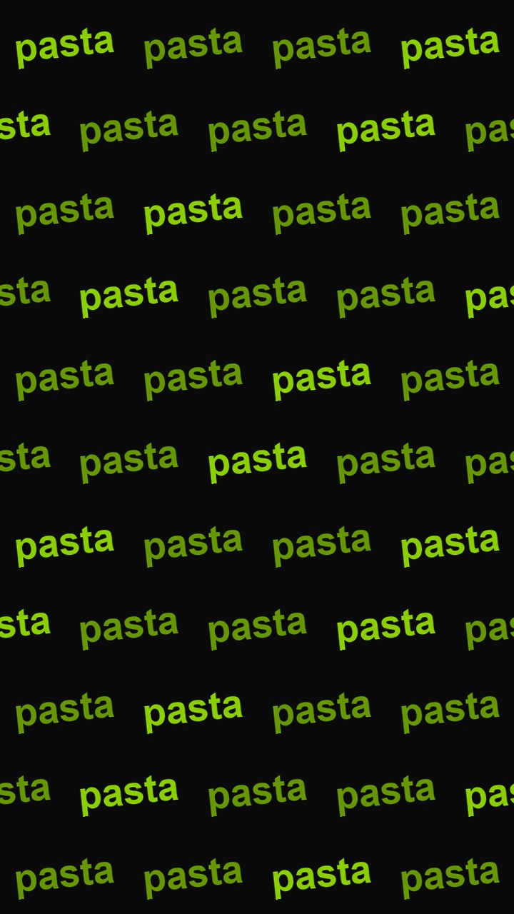 field #0a0a0a, 4 columns x 11 rows, solid finish
Quotes
Made with the quote card maker. The type size is solved from the line length, which is why the short ones fill the frame and the long ones do not.
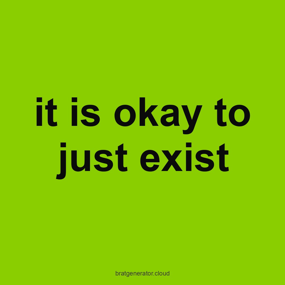 quote card: #8ACE00 field, black lowercase, auto-fitted to 150px
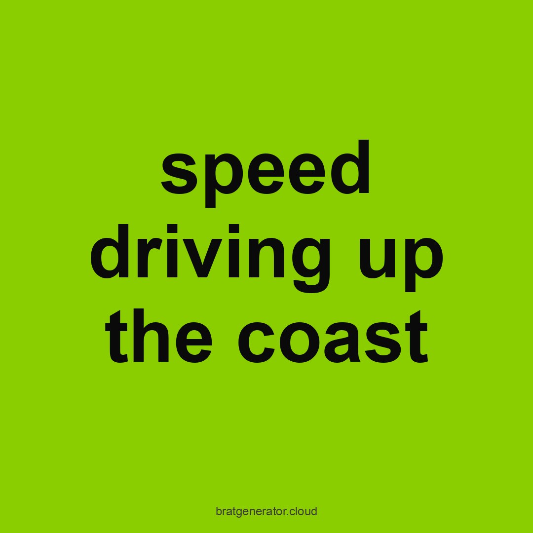 quote card: #8ACE00 field, black lowercase, auto-fitted to 150px
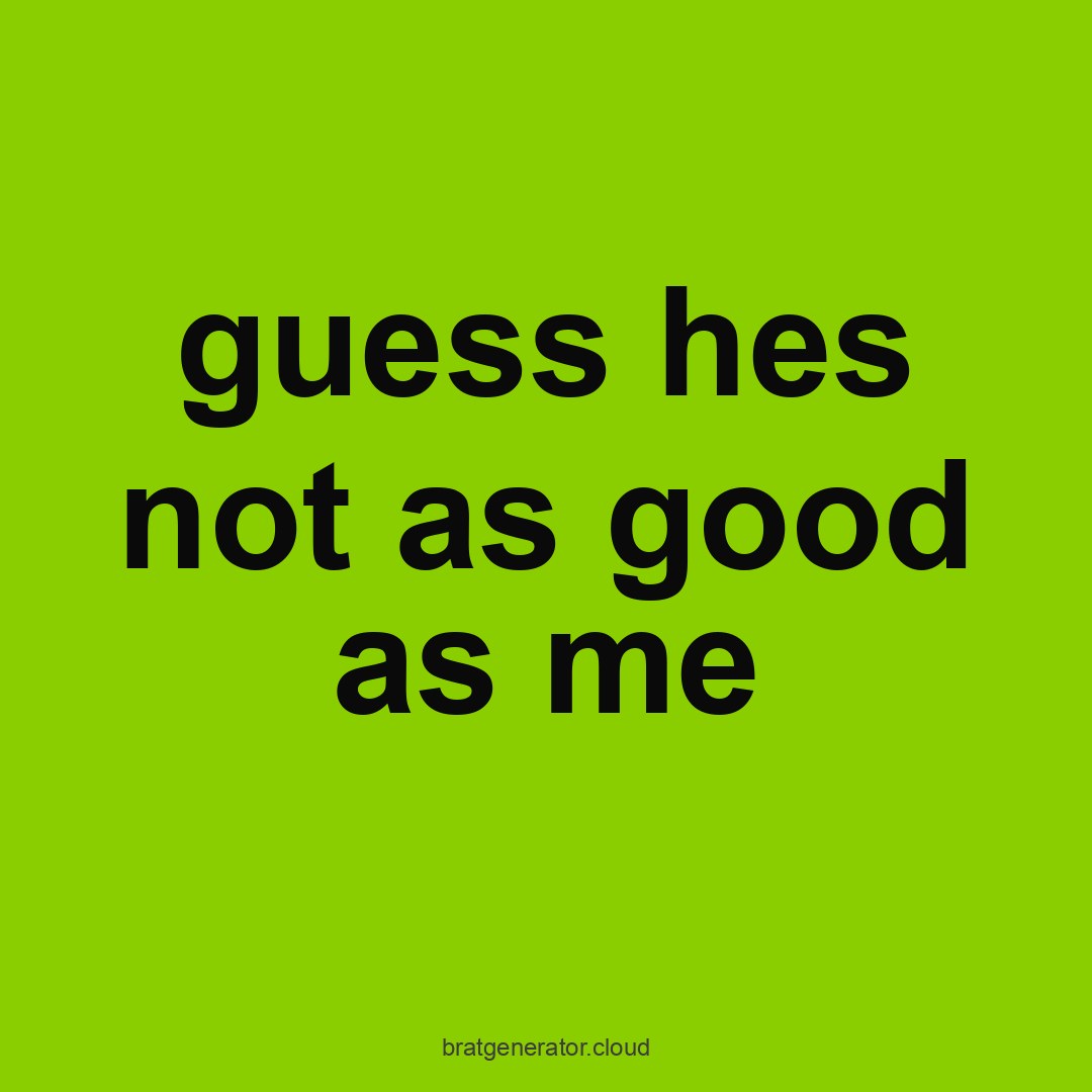 quote card: #8ACE00 field, black lowercase, auto-fitted to 150px
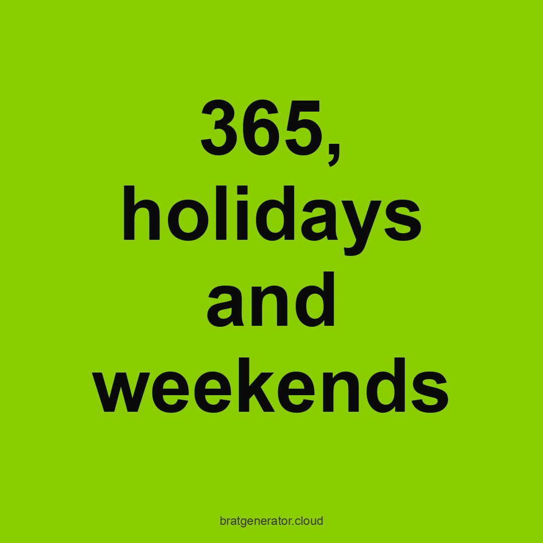 quote card: #8ACE00 field, black lowercase, auto-fitted to 150px
Tracklists
Made with the tracklist maker. Titles are invented for these examples — the point is the layout, not the songs.
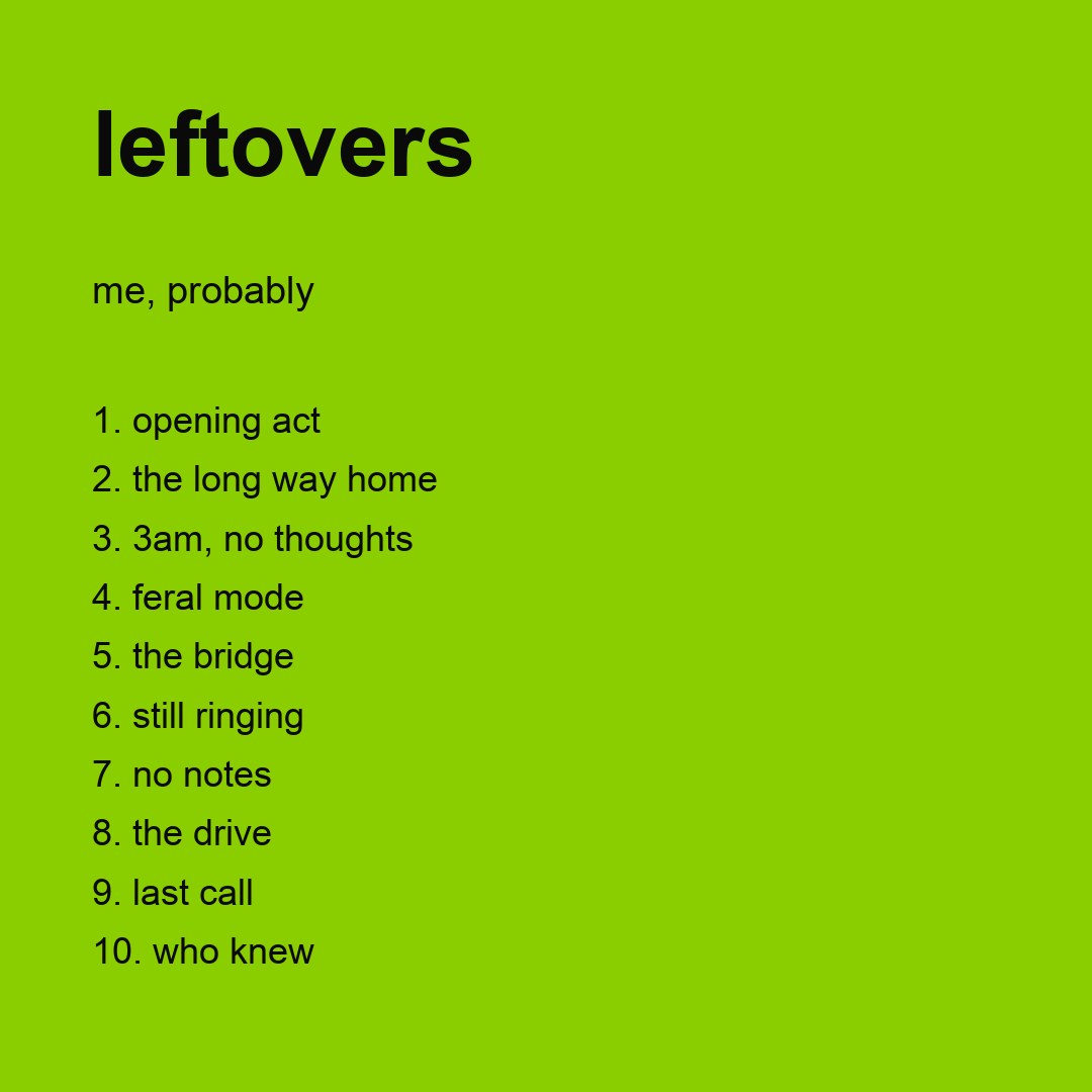 tracklist: 10 tracks, numbered, type auto-fitted to 36px
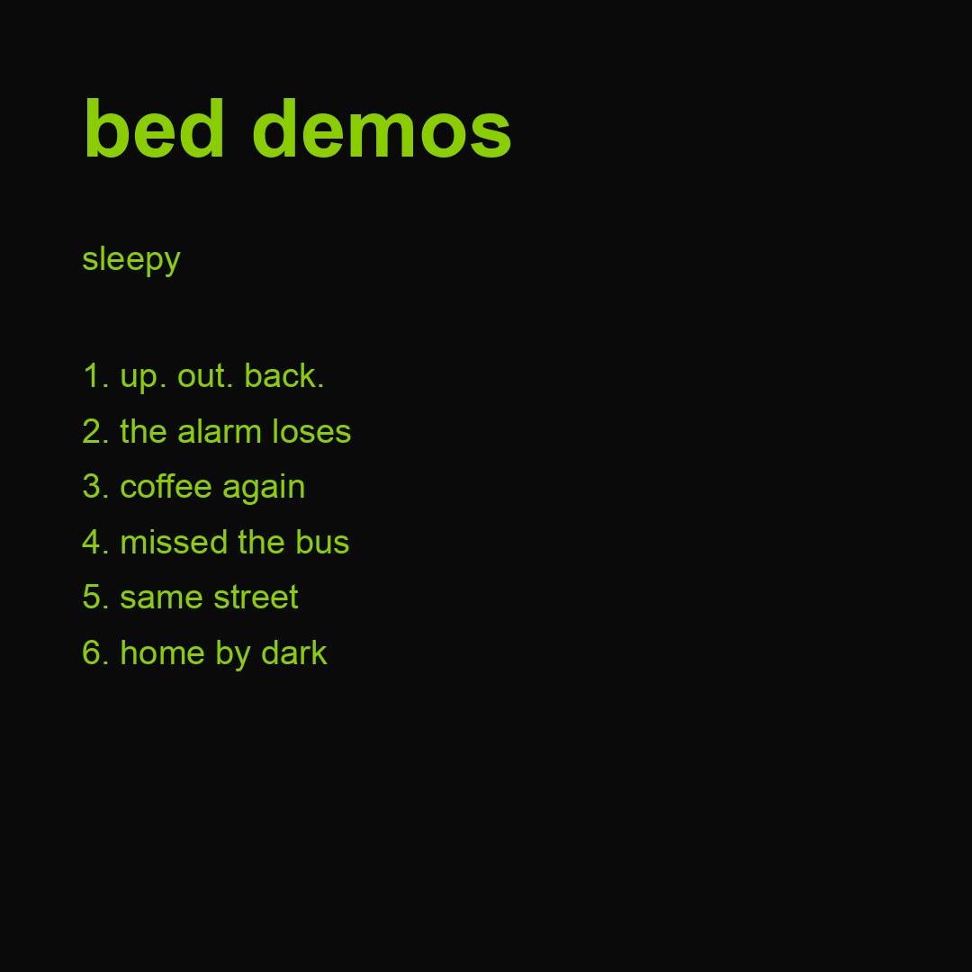 tracklist: 6 tracks, numbered, type auto-fitted to 38px
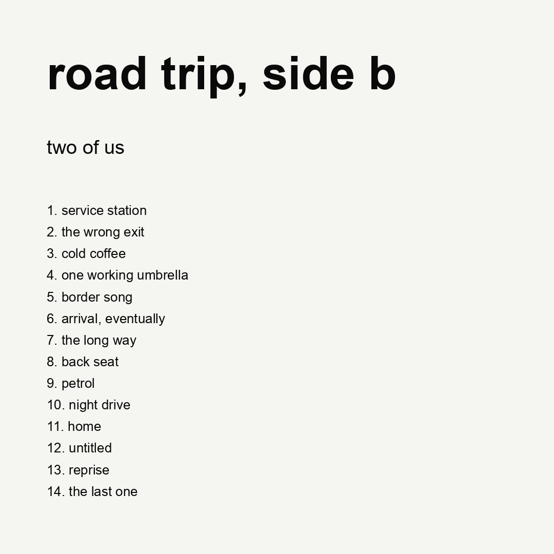 tracklist: 14 tracks, numbered, type auto-fitted to 26px
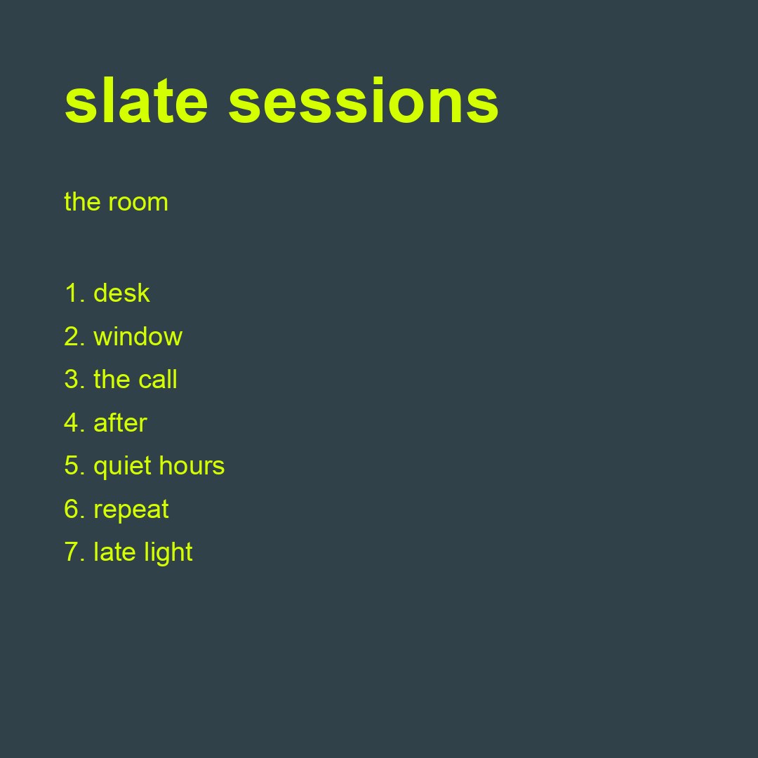 tracklist: 7 tracks, numbered, type auto-fitted to 38px
Stickers
Made with the sticker maker. These are transparent PNGs; the dark page behind them is the transparency doing its job.
 sticker: transparent PNG, white outline 10px, 3 degree tilt
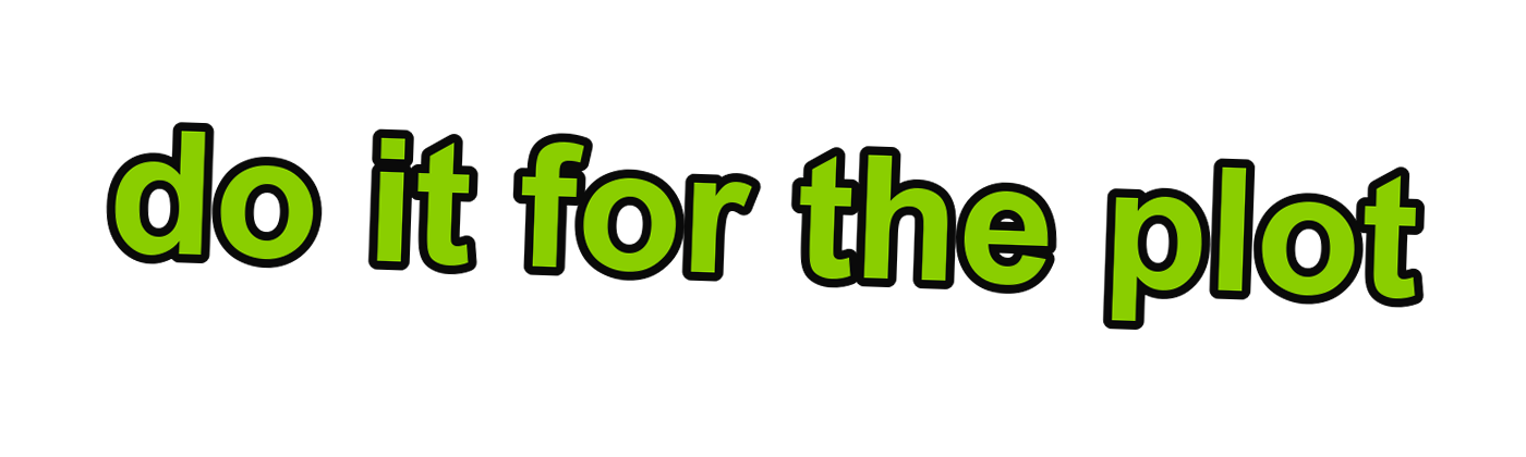 sticker: transparent PNG, white outline 8px, -2 degree tilt
 sticker: transparent PNG, white outline 12px, 0 degree tilt
 sticker: transparent PNG, white outline 9px, 4 degree tilt
ASCII
Made with the ASCII tool, shown in a monospaced font — the only condition under which banner text survives. Paste one into a caption field and it shears.
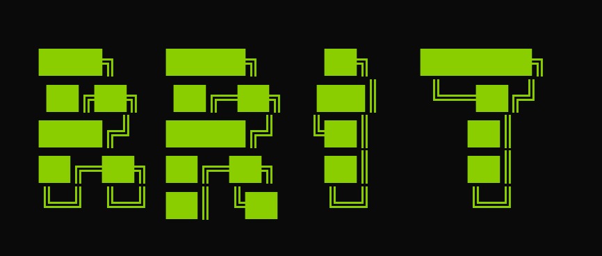 ASCII banner, “standard” face, 33 chars wide
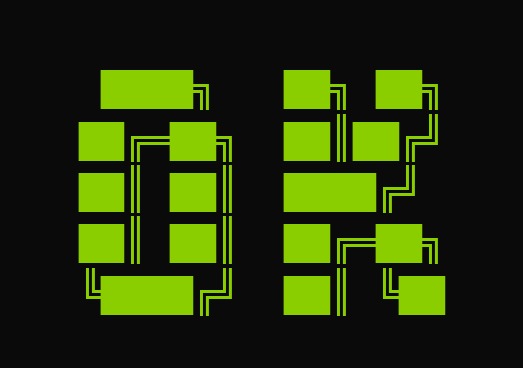 ASCII banner, “3-d” face, 18 chars wide
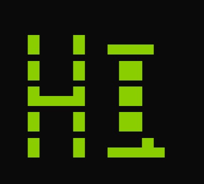 ASCII banner, “doom” face, 13 chars wide
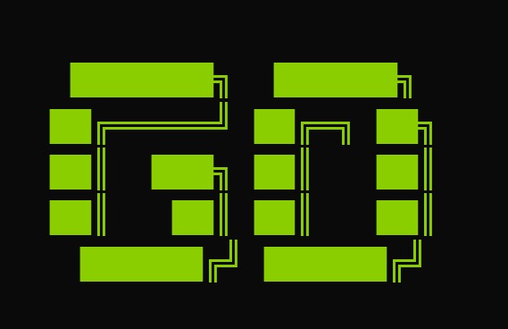 ASCII banner, “big” face, 20 chars wide
Line ideas, by situation
The pictures above are only half of it — the line is the other half. Ten starting points, each with the reason it works. Swap the specific noun for yours and the shape holds.
| Situation | Line | Why it lands |
|---|---|---|
| An announcement | new menu. friday. | date + nothing else. the period is the tone. |
| A release | out now. obviously. | two words, one assumption. |
| A gig or event | saturday. loud. | day and adjective, no verb needed. |
| A playlist | 3am. again. | a time is a genre. |
| Travel | the last train knows me. | personify the infrastructure, not the destination. |
| Fitness | new gym. old me. we will see. | three beats, the last one honest. |
| Study or work | deadline. tuesday. do the math. | hand the reader the conclusion. |
| A mood | unbothered. which is the point. | state it, then refuse to defend it. |
| Food | 8am. same order. no notes. | ritual is funnier than enthusiasm. |
| An apology you do not owe | quiet. not gone. | two beats, no explanation. |
How these were actually made
Worth being precise, because the details are the useful part.
- The covers use the generator’s own values. Its field is
#8bdc65with#111111ink and White Mode at#f5f5f2— the slightly softer green the tool actually paints, not the#8ACE00quoted in most write-ups including several pages here. The difference is subtle but real, and if you are matching a cover to a palette, use the value the export gives you. - Type is Arial, always lowercase. The generator starts at the size you set and shrinks two pixels at a time until the block fits inside roughly the middle 72 per cent of the canvas. It never grows, which is why a four-letter word at the default size looks small: the tool is obeying you, not composing.
- Walls are tiled, not stretched. Alternate rows shift half a column and every instance is rotated a few degrees. That offset is what stops the grid reading as a table.
- Tracklists and quote cards auto-fit. The type size in those captions is the size the tool solved for, not one chosen by hand.
- Stickers are genuine alpha. They are transparent PNGs; the dark you see is this page behind them, which is exactly what will happen when you drop one onto a story.
- ASCII is monospaced on purpose. Those banners are text, and they only look like that in a fixed-width font.
What the set shows about the format
Look at the whole page rather than any single tile and four things are obvious. Restraint scales: the examples with one element and one colour are the ones that survive being shrunk to a thumbnail, and everything busier is doing worse at exactly the size most people will see it. Length is a design input: the same field that makes a three-word line look confident makes a nine-word line look like a flyer. Punctuation carries tone: the full stops in these examples are doing the work exclamation marks would ruin. And the pattern is the most durable shape here — because a repeating grid survives any crop, while a centred line survives only the one it was designed for.
FAQ
Can I use these examples?
The images are yours to reuse, including commercially — they are original graphics made for this page with no stock material and no third-party artwork in them. What you should not do is pass a specific artist’s cover off as one of these; the format is public, the reference is not.
Why do the covers look less blurred than the album?
Because the generator draws crisp type — the blur control lives in the font and logo tool. The original cover’s softness came from an export accident; reproducing it is a choice, not a requirement, and at small sizes crisp usually wins.
Are these the settings you recommend?
They are settings that work, chosen to show range rather than to prescribe taste. The defaults are a starting point: for a short word, push the size up; for a long line, cut the line before you cut the size.
Why no photo examples?
Because a gallery of other people’s photographs would be a licensing problem, and a gallery of stock photos would be a different site. The text-on-photo guide explains what to look for in your own images instead.
Will you add to this page?
As the tools grow, yes — new finishes and canvases need examples or nobody finds them. If a specific output of yours is missing and you want it shown with parameters, the support address gets read.