
A wallpaper is the only graphic you look at two hundred times a day, which makes it the one piece of design in your life that has to survive being familiar. Most people treat it as a decorative afterthought and pick something pretty once. The better move is to treat it as a small, deliberate object: one word, one colour, sized for the specific rectangle your phone actually shows you.
This is a practical guide to doing that properly — what a lock screen really displays, why a repeating pattern beats a single line, and how to check the result on the device instead of in the editor.
What a lock screen actually shows you
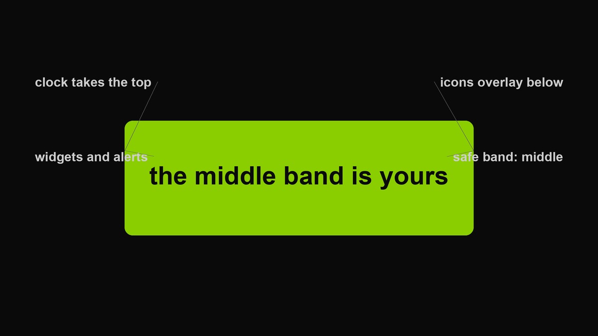 The four zones of a lock screen. The middle band is the only region you reliably control, and it is smaller than it looks.
The clock and date occupy the upper third, in a large translucent typeface that the operating system chose, not you. Below that sits a strip of notifications and widgets. The bottom holds the camera shortcut, the flashlight, and a pill for gesture navigation. When the phone unlocks, the launcher adds an icon grid over whatever you placed there.
Two consequences. First, the usable region is a horizontal band roughly across the middle of the frame — anything you place above or below it will be partially covered most of the time. Second, whatever you make will be composited with other people’s typography: the clock’s letterforms sit on top of your letterforms. That is the real design constraint, and it is why a busy wallpaper looks chaotic rather than expressive.
One word, or one word and a date
The strongest wallpaper layouts are not really about the word — they are about the word plus a piece of information that only you know the significance of. A place name and the month you were there. A practice and the day count. A project name and a version number. Two elements give the eye something to assemble, and the assembling is what makes it personal rather than decorative.
The rule is that the second element has to be small enough to be missed by anyone else. A wallpaper that explains itself to strangers is a sign; a wallpaper that only you have to decode is a talisman. This is also where the density controls earn their keep — the pattern carries the identity, and the one-off detail sits in a corner at a quarter of the size, which is a layout no one else can read.
Resist the urge to add a third element. Two is a composition; three is a noticeboard, and a noticeboard on a lock screen is how you end up with a wallpaper you stop seeing entirely.
Why a pattern survives where a single line fails
A single centred line on a phone wallpaper is a fragile object: it must land in the middle band, it must not collide with the clock, and it must still read when the icons overlay it. A repeating pattern has no such problem, because any crop of it is still the same object. The clock covers part of it and the result is still coherent.
This is the reason the wallpaper format leans toward repetition rather than a poster layout, and it is also why the density controls matter more than the colour. Too sparse and the pattern reads as a few random words that escaped. Too dense and it becomes texture, at which point you might as well use a solid colour.
Choosing the word
One word, and not a slogan. A slogan is a sentence that wants something from you; a word is a label. The categories that hold up over months rather than weeks: a place you keep going back to, a practice you are actually doing, a word you find funny in your own private way, or the name of a thing you own.
The two-word exception is a noun plus a qualifier — the specific beats the grand. “late again” will still make you smile in three months. “no excuses” will start feeling like a schoolmaster by week two, which is the fate of almost every motivational wallpaper ever chosen by someone who was motivated at the time.
And a warning about the personal kind: a name you love is a beautiful wallpaper and a genuine security problem if you lose the phone in public, where it is displayed on the lock screen for whoever picks it up. Use it if you accept that; do not use it because you did not think of it.
Why lowercase does the heavy lifting
On a wallpaper, capital letters are loud in a way that has nothing to do with size. A capital has a different height from its neighbours, so a repeated word in capitals produces a jagged skyline that the eye has to re-parse every time it scans the row. Lowercase gives you a consistent rectangular block, which is what allows repetition to read as texture instead of as a list of shouts.
There is also a tonal effect. Lowercase reads as speech — something someone would actually say — while capitals read as a command or a warning. A wallpaper that instructs you twice a hundred times a day is a wallpaper you will quietly resent by week three, which is the mechanism behind the great majority of abandoned custom wallpapers.
The tools here force lowercase on purpose, and it is the single reason a generated wall looks composed rather than aggressive even when the colour is a neon yellow-green.
Density, contrast and the squint test
Set the columns first, then the rows. Columns decide how big each instance can be, and the size is what carries the word. Four across is comfortable for a short word on a phone; six or more turns the letters into texture and the wall stops being readable at arm’s length.
Contrast is the one thing people get wrong in the flattering direction. A wallpaper should not shout, because it sits behind everything else; but a wall with too little contrast disappears exactly when you want it — in bright daylight, outdoors, which is when you look at your phone most. The test is the squint: relax your eyes until the detail blurs. If the word is still visible as a shape, the contrast is right. If it vanishes, raise the density or move to the solid finish.
Colourway: dark, light, or loud
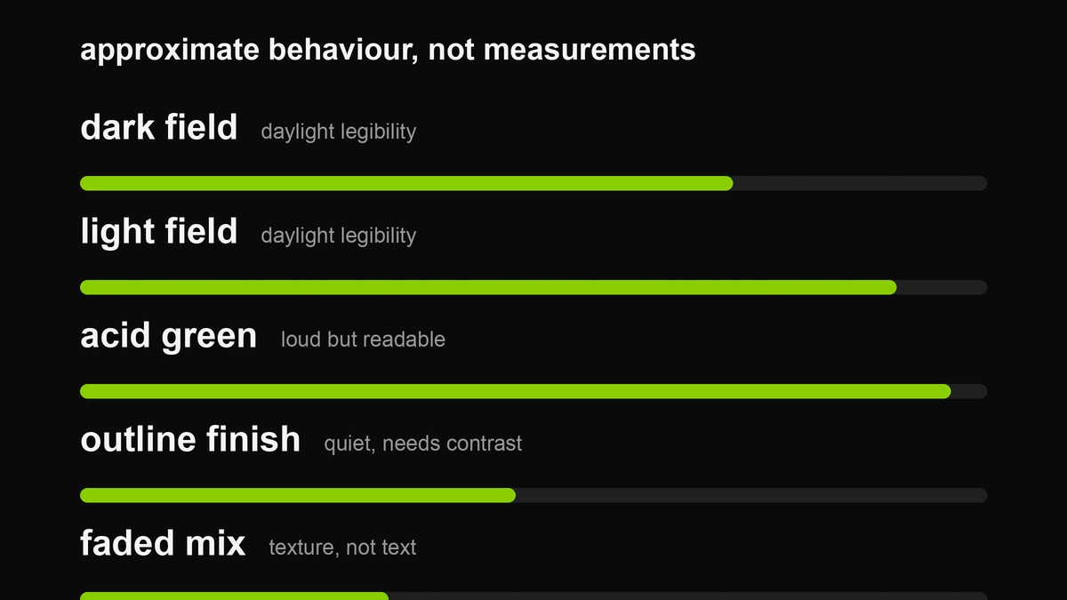 Approximate behaviour, not measurements. The two extremes both fail for different reasons: one disappears outdoors, the other burns through an evening of looking.
Dark fields are the practical default. They are kinder to OLED panels at low brightness, they hide fingerprints, they let the clock sit on top without fighting, and they read as calm. The failure mode is that a very dark wall and a very dark text colour are invisible in sunlight.
Light fields read better outdoors and worse indoors at night, when they act as a lamp pointed at your face. If you use one, keep the text dark and the density low.
The acid green is neither. It is a loud field with high luminance, which means it is visible everywhere and subtle nowhere. That is the point of it, and it is also why the faded or outline finishes are usually the better choice for a wall you will live with: you get the identity without the neon tube.
Aspect ratios, notches and why export size matters
Modern phones are roughly 19.5:9 to 20:9, and the tool exports 1080×1920, which is 16:9. That mismatch is deliberate and harmless for a pattern: the system will crop the top and bottom slightly rather than letterbox, and a repeating grid cropped is still the same grid. A single centred line is the layout that suffers from this, which is a second reason to prefer the tiled approach.
If you want an exact fit, choose the phone canvas and accept the crop, or export the square and let the system scale it — scaling loses less than cropping for a pattern. What you should not do is stretch a 16:9 image to a 20:9 screen by forcing it; the letters go narrow and the design looks wrong without anyone being able to say why.
Making it, in the tool
- Type the word. Lowercase happens automatically, and it is what keeps the repetition calm.
- Choose the phone canvas. Save the square and desktop exports for their own uses.
- Pick a colourway. For daily use, the dark field or the outline finish; for a statement, classic green with the faded mix.
- Set columns between three and five, rows between six and ten. Adjust rows until the vertical spacing looks like breathing rather than stacking.
- Export, then set it on the phone before you decide it is finished.
Lock screen, home screen, and the pair
Most people pick one image and let the system use it for both surfaces, which is a mistake because the two screens have opposite requirements. The lock screen is viewed for a few seconds, in any light, with a clock over it — it wants presence. The home screen is viewed for minutes at a time with an icon grid over almost every pixel — it wants restraint.
The pair that works is the same colourway at two different intensities: the louder version on the lock screen, the faded or outline version on the home screen. Same identity, different volume. Using the loud one on both is why custom wallpapers start feeling exhausting after a fortnight, and using the quiet one on both wastes the pattern entirely.
If you want a third surface, the desktop is where the outline finish genuinely belongs — windows cover most of it anyway, so the shape of the word matters more than the word.
Testing it where it lives
The editor lies to you in three ways: the preview is scaled, there is no clock over it, and your screen is brighter than the phone will be. So set it, lock the phone, and look at it in the light you actually use it in. Then unlock it and look again with the icon grid on top. Two adjustments usually follow — more contrast, or fewer rows — and both are invisible from inside an editor.
Live with it for a day before changing anything. A wallpaper that feels exciting immediately is usually one you will want to replace within a week; the ones that feel slightly restrained on day one tend to still be good on day forty.
Making a set for a group
Patterns scale to groups in a way single lines do not. A shared word, one colourway, and each person gets a different density is a set that reads as belonging together without being identical — useful for a team, a community, a running crew, or a group chat that has decided, for reasons, that everyone changes their wallpaper.
Two practical notes for that case. Keep the word short, because long words at high density turn to mush at phone size and the whole point is that everyone’s looks right on every device. And export at the phone size rather than the square, because the pattern has to survive the crop the system applies, and a square source cropped to a tall screen shifts the rhythm visibly.
Desktop and tablet
The desktop canvas is a different problem with the same tools. A 1920×1080 wall sits behind windows, a taskbar and icons arranged in columns, so the usable area is the top-left and the far right edge. Density should go down, not up — a pattern that reads well on a phone becomes visual noise behind a code editor. The outline finish is almost always the right call here.
Tablets sit between the two and get split into halves by multitasking more often than you would think. Repeat generously and keep the word small.
Regrets that show up after a week
Patterns in hindsight: too dense, always. The first impression of a tight grid is “designed”; the tenth is “busy”, and by the twentieth it registers as static. Looser than feels right is the durable setting.
Second: the joke that dates. A wallpaper built around a reference will be legible to you long after it stops being funny, and you cannot un-see it. Pick something that survives being understood.
Third: contrast chosen for the showroom. The bright field that looked confident indoors at noon is a headache on a night train. Test in low light before you commit, and keep the outline variant as your evening version.
What not to do
- Your own face. It reads as a device you lost, not as a design.
- A quote with punctuation. A sentence on a wallpaper becomes a poster, and posters are for walls you do not look at twice a day.
- Maximum density. At some point the word stops being a word and becomes a fabric. That is a legitimate choice, but choose it on purpose.
- A high-key field for night use. Your retinas will file a complaint, and so will anyone sitting next to you on a train.
The point of doing it yourself
A wallpaper is not a design brief, and nobody is going to judge it. That is precisely what makes it worth ten minutes. You are allowed to want the same four letters in front of you two hundred times a day, arranged in a way only you have a reason for, in a colour that means something because of a specific week and not because of a trend report. Mass-produced backgrounds are neutral in exactly the way a chosen one is not, and the difference is invisible to everyone else and obvious to you.
FAQ
Why is my word cut off at the top?
Because the clock occupies the upper third and the system crops the frame. Use the patterned finishes, which survive cropping, or move to the square canvas and let the phone scale it.
Does a dark wallpaper really save battery?
On OLED panels, yes, at low brightness with large dark areas — dark pixels draw almost no power. On LCD screens, no: the backlight is on regardless. Which means the honest answer is “depends on your phone, and probably not as much as the articles claim.”
Why does it look different in my gallery than on the lock screen?
The gallery shows the whole file; the lock screen shows a cropped, dimmed version with a clock composited over it. Judge it on the lock screen.
Can I use a photo instead?
Not with this tool — it draws a pattern, it does not composite images. The photo overlay tool is the one for putting a line on a picture.
Should the wallpaper match my feed?
Only if you want the feed to look like a poster campaign for your phone. A wallpaper is for you; a feed is for an audience. The overlap is nice when it happens, and forcing it is how both start feeling like a brand you are contracted to.
Is the export uploaded anywhere?
No. The pattern is drawn in your browser and the PNG is assembled locally. Close the tab and it is gone.
Related: the wall generator, the green colour page for the exact values and their contrast behaviour, and the consistency guide if the wallpaper is part of a set.