
Putting text on a photo fails in two opposite ways, and people manage both in the same afternoon. Either the words vanish into the picture, or the words arrive and the photograph stops mattering. The good version is a narrow ridge between them, and it is reachable with a short list of decisions rather than with taste.
The hierarchy problem, which is the whole problem
A composition has one leader. When you add text to a photograph you are asking for a second one, and the picture does not know it has been demoted. That is the entire difficulty, and it is why “make the text bigger” and “make the text smaller” both feel wrong: neither resolves who is in charge, they just change the volume of the argument.
There are only two stable answers. Either the text leads — in which case the photograph should be flattened, darkened, cropped or replaced by a field so it stops competing — or the photograph leads and the text is a small, well-placed annotation that never touches the subject. Everything in between reads as a decision avoided, and viewers feel it even when they cannot name it.
The useful diagnostic is to look at your composition and ask which element your eye visited second. If the answer is “the same one,” the other element is not doing anything. If the eye bounces back and forth, you have the argument, and the fix is to demote one of them on purpose.
Why most photographs cannot hold text
Legibility on an image is a local contrast problem. A letter is readable when the boundary between its ink and whatever sits immediately behind it is strong — not when the overall image is bright or dark, but in the few pixels around each stroke. Photographs are uncooperative about this for three reasons.
Edge density. A crowd, a forest, a shelf of product: the image is full of edges, and letter edges compete with them. The result is text that is technically high-contrast and practically unreadable, because the eye cannot tell which edges are the message.
Mid-tone uniformity. Most of a photograph sits in the middle of the tonal range, which is precisely where both white and black text fail. A field of mid-grey defeats both, and mid-grey is what walls, roads, sky at dusk and out-of-focus backgrounds all look like.
Attentional competition. A photograph has a subject, and the subject wants to be looked at. Text placed over it is not layered on top of the image; it is arguing with it. This is the reason a busy photo plus a big word reads as a mistake even when the contrast maths passes.
Three tests before you choose a photo
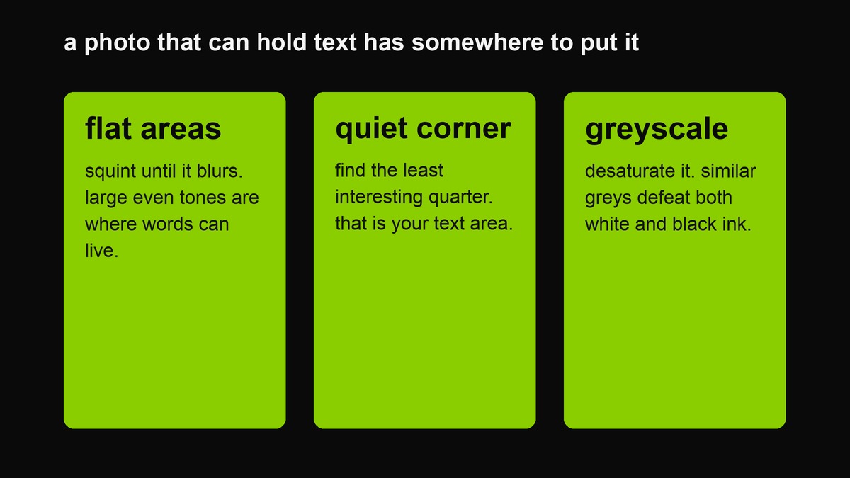 A photo that can hold text has somewhere to put it. These three tests take about fifteen seconds and save an hour of nudging opacity.
The flat-area test. Squint until the photo blurs. Are there large regions of roughly even tone — sky, water, a wall, a dark corner, an out-of-focus foreground? Those are the places text can live. A photo with no flat areas has nowhere for words to go.
The quiet-corner test. Pick the least interesting quarter of the frame. If you can put a line there without covering anything you care about, the photo will cooperate. If every corner has something in it, the photograph is finished and does not need you.
The greyscale test. Desaturate a copy mentally or with a filter. If the image becomes a mess of similar grey values, white text will not survive it. If it separates into clear light and dark masses, you have a design surface.
Decide what the text is for first
Three jobs, three different layouts, and most failures come from doing the wrong one.
A label names the thing in the photo: a place, a date, a title. It should be small, quiet, out of the way, and set in a corner the image does not need. A label that dominates has stopped being a label and become an announcement.
A caption says something the photo cannot. It sits close to the image, usually under it, and it can be longer because it is being read rather than glanced at. A caption inside the frame is a mistake people make constantly — put it below, where the reading happens.
A poster is the case where the words are the subject and the photograph is the backdrop. It can be loud, centred and large, because the photo has agreed to be scenery. This is the only one of the three where the treatments below are worth much, and it is worth knowing which one you are doing before you start adjusting opacity.
The three treatments, and when each is right
Darken the whole image. The safest and the dullest. A uniform scrim drops the entire frame’s luminance so white type reads anywhere. Use it when the text matters more than the photo, when the image is genuinely busy, or when you are in a hurry. The failure mode is over-darkening, which produces a moody rectangle with faint writing on it — a look so common it has become its own cliché.
A solid band behind the text. Keeps the photograph bright and puts an opaque strip only where the words sit. It reads more designed than a scrim because it admits what it is doing. Use it when the image has a subject you want to keep visible, and place the band across the least valuable part of the frame.
A coloured field above and below. The image becomes a band inside a poster. Text sits on solid colour, so legibility is guaranteed and the photograph is framed rather than annotated. This is the option that looks most like a deliberate graphic and least like a photo with words on it — and it is the one that works when the photograph is too busy for the other two.
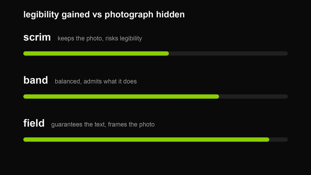 The trade-off in one line: the more certain the text, the less of the photograph survives unconstrained. Pick per job, not per taste.
Choosing an ink colour that belongs to the photo
White and black cover almost everything, and picking between them is a contrast decision, not a taste one. But when you want the text to feel part of the image rather than laid on it, take the ink from the photograph itself — the lightest tone in a dark picture, or the darkest tone in a bright one. The result reads as considered because it is literally drawn from the frame.
Two cautions. Saturated colours make poor ink: a mid-chroma green or orange sits in exactly the tonal band where both white and black would have worked, so it loses to the photograph behind it. And an ink lifted from the image must still clear the local contrast test — belonging is not the same as legible, and the second requirement beats the first every time.
If you cannot resolve it, go back to white on a darkened frame. It is boring because it works, and the photograph will still be the interesting part.
Placement is a search problem
Find the quietest region first, then write the line to fit it, rather than the reverse. In practice that means: centre the text only when the centre is genuinely empty; place it low when the interest is at the top; and never place a line across a face, a horizon, or the thing the photograph is about.
One habit fixes most placement errors: view the composition upside down. Reversing the image suppresses your interest in the subject and makes the structural imbalance obvious — if the text looks like it is sliding off the frame when inverted, it is.
Contrast maths is only a starting point here
The standard contrast ratio assumes a flat background. A photograph has no single background value, so the arithmetic gives you a floor rather than an answer. The useful version: sample the darkest and lightest values in the region behind your text, and check your ink against both. If it passes against the worse of the two, it will hold. If you cannot tell, use the band or the field treatment, which removes the question entirely.
White text on a darkened photo is the only pairing that works reliably across unknown images. Black text needs a genuinely light area behind it, which photographs rarely provide evenly — and a shadow behind black type is a hack that shows.
Type decisions
- Weight. Heavy. Thin strokes disappear into photographic detail first, and a thin face over a busy image is the most common legibility failure after contrast.
- Size. Larger than the composition wants. The instinct to keep the text small so the photo “stays the hero” produces text nobody reads on a phone at arm’s length.
- Case. Lowercase reads as voice, capitals read as signage. Pick according to whether you want the line to sound like you or like a warning.
- Edges. A slight blur on the letterforms reads as photographed rather than pasted; too much and it reads as a mistake. A hard shadow is almost always worse than either option.
The two tests that settle it
The thumbnail test. Shrink the composition until it is the size of a chat preview. If the words are gone, they were never going to be read. This is the single most predictive test, because most of your audience will see it at that size first.
The squint test. Relax your focus. The image should reduce to two or three masses with the text forming a fourth. If the text merges into the background mass, contrast is insufficient; if it forms a dark blob fighting a bright subject, the treatment is too heavy.
A workflow, start to finish
The order matters, because each step is cheap at the start and expensive later.
- Pick the line first. Write it, cut it to something under eight words, and know what it is doing — label, caption or poster.
- Then pick the photo. Run the three tests above. If nothing passes, choose a different photograph rather than a different treatment; no scrim rescues a frame with no quiet space.
- Set the canvas to where it will be seen. Square for the grid, tall for stories, wide for previews. Cropping afterwards is how text ends up under an interface element.
- Choose the treatment. Field if the words lead, band if the photo leads and the words must be readable, scrim if you are in a hurry.
- Darken until the text is boring, then stop. The point is legibility, not mood.
- Export and check at thumbnail size. One look at chat-preview scale tells you more than five looks at full size.
Six steps, and the whole thing takes about as long as writing the line, which is the part that actually needed the time. If you find yourself repeating step two often, that is not a photography problem — it is a sign the composition you want is a field with text on it, and you should save yourself the argument.
What this format is bad at
Portraits, mostly. A face is the strongest thing in any frame and it will win every argument you have with it; putting a line across a portrait reads as captioning somebody without asking. Also: high-key images (snow, beaches, white rooms) where a scrim looks like a dirty lens; product shots where the words obscure the thing being sold; and any photograph where the text is doing work the picture should be doing — at which point the honest answer is two separate images.
When to give up and use a field
There is a moment in every photo-plus-text attempt where you notice you have been adjusting the same slider for four minutes. That is the signal. The photograph is not going to cooperate, and continuing produces a darkened image with faint writing on it — the worst of both formats, and a look so common it now reads as a template.
The honest alternatives are all better than another minute of opacity. Crop until you find a flat region and place the line there. Move the text below the image, where it becomes a caption and stops fighting. Or take the words out of the photograph entirely and put them on a solid field, which is what the rest of this site is for. A flat field with one line is not a compromise version of a photo with text on it; for most purposes it is the better object, and it takes twenty seconds instead of twenty minutes.
FAQ
Can I put text over a face?
You can, and it is almost always the wrong call. Faces are the highest-priority object in human vision; text across one is read as defacement regardless of how well it is spaced or how good the contrast is. Put the line beside the face, below it, or on a band that deliberately avoids it.
Does a heavier scrim fix a busy photo?
It fixes the legibility and ruins the photograph, which is a trade and not a solution. A genuinely busy image wants a field treatment — accept that the words need their own surface and give them one, or crop until you find a quieter region.
Why does my text look soft rather than bold?
Usually because the photo behind it is mid-tone and slightly noisy, which eats the edges of the letterforms. Increase the darkening, or move the line onto the band. Sharpening the text is treating the symptom.
Should the text be the same size as the photo’s subject?
No, and the question is a symptom. There is one dominant element in a composition; if you have two, you have a fight. Decide which one the viewer should meet first, then size the other accordingly.
Why does my export look different from the preview?
The preview is scaled to fit the page and the file is at export resolution. Check the file, and check it again at thumbnail size, which is the size most people will actually see.
Can I place the text off-centre?
Not in this tool — the band treatment is the current way to move the line away from the middle. Off-centre placement is a good idea in general and a bad idea to attempt with a tool that does not support it.
Does the photo get uploaded?
No. It is read locally, drawn to a canvas in the same page, and handed back as a new PNG. There is no request in this page that could carry it anywhere.
Is a photo with text worse than a plain cover?
Often, yes, and knowing that is a skill. If the photograph is not doing specific work, a flat field with one line is clearer, faster to make and more legible at small sizes. Use a photo when the photo is the point.
Related: the photo cover tool, the green colour page, which computes contrast ratios live, and the platform guide for what each surface does to your export afterwards.