
Nobody argues about the front cover of an album for very long. They argue about the tracklist — about what is at the end, about the song that should have been a single, about the fact that there are nineteen of them. The back of the record is where the argument actually happens, and it is the piece of artwork most likely to be screenshotted, quoted and dissected by strangers.
Which means it deserves more thought than a list typed in a text box. This is a short guide to making one that people read to the end.
What a tracklist is actually for
Three audiences, three jobs. The person deciding whether to press play wants to know whether the record sounds like something they like — and titles are the only clue they get before listening. The person who already loves it wants to argue about the order. The person who will never hear it wants a screenshot that says something about their taste. All three read the same list, and none of them are looking for the same thing.
That is why the format has survived every change in music packaging. The tracklist is the one piece of an album that is genuinely for the reader rather than for the artist, and it rewards being designed with that in mind: legible, ordered, and honest about its length.
Why the tracklist is a design object
A tracklist is the only part of a release that is genuinely informational, and information is where design earns trust. A cover can get away with being a mood; a list of fourteen things has to be legible, ordered and honest about its own length. Get it right and it reads as an artist who has thought about the sequence. Get it wrong and it reads as a file export.
It is also the most reusable asset in a release. The cover appears once; the tracklist appears as an announcement, a story tile, a comment reply when someone asks, and a screenshot in a group chat saying “track six.” Design it once, properly, and it works for months.
Numbering is a promise
Add numbers and you have told the reader that order matters. Without them, the list is a pile — people scan for a title they recognise and stop. With them, the reader starts at one and goes down, which is a completely different behaviour and the one you want if you made an album rather than a collection of singles.
The consequence is that the numbers make the sequence visible in a way titles alone do not. Everyone can see that the best song is track seven, and everyone can see that you knew it. There is no fixing this with design; it is a content decision, and the honest answer is to sequence the record properly before you list it.
One exception worth knowing: on a physical back cover, numbers are conventional. On a social post, they are a claim about order. Decide which audience you are showing it to.
Title length, and the rhythm it creates
Tracklists read as shapes before they read as words. A column of two-word titles makes a clean edge; a column where every third title is a sentence makes a ragged one that the eye has to renegotiate each line. Neither is wrong, but you should be doing it on purpose.
The practical limits: under about twenty-four characters a title fits one line at readable size. Past that it wraps, and a wrapped title in a numbered list looks like a paragraph, which breaks the vertical rhythm that makes the list scannable. If half your titles wrap, the titles are too long, not the canvas too narrow.
The other rhythm tool is capitalisation, and the answer here is the same as everywhere else on this site: lowercase. Capitals give every line the same shout; lowercase gives you a block of text that reads as one voice.
Writing titles that survive a list
In a list of fourteen, each title is competing with thirteen others for the same glance. Two properties help. Length variance — a short title after two long ones is a beat, and beats are what make a list readable rather than merely scannable. Consonance — titles that share a grammatical shape (“the…” six times) read as a system, which is a good effect once and a pretentious one twice.
What to avoid: titles that only work when spoken aloud in a language only you speak, titles that are just a date, and titles that require a footnote. The list is the marketing for the song, and a song whose title needs explaining has a title problem, not a listener problem.
And one practical note that saves hours: write the titles into a plain text file first, one per line, and edit there. A tracklist is content before it is design, and rearranging a text file is faster than re-exporting an image every time you change your mind.
Fourteen is the ceiling, and it is an editing tool
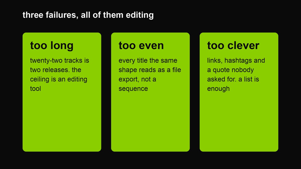 The three ways a tracklist stops being read. All three are editing problems wearing design clothes.
Fourteen lines is roughly what fits on a square canvas at a size a phone can display comfortably. That constraint is useful, because it converts an argument you were having with yourself into a number. If you have twenty-two tracks, you have two releases or fourteen tracks and eight ideas.
The other thing the ceiling does is expose the filler. A list that must fit fourteen has nowhere to hide the two songs that exist because the format wanted them. Most of the time you will find you did not need them, and the list reads better for the shorter version even to people who never heard the longer one.
Sequencing signals people read whether you meant them or not
Positions carry meaning, and audiences have learned them from a hundred other tracklists.
- One is the door. It should be short, immediate, and not the difficult one.
- The closer is the last word. Long, final, or quiet in a way that reads as deliberate.
- The middle is where the experiments live, and everyone knows it, which is why the middle is where the interesting ones survive.
- The second-to-last is where the song you are secretly proud of goes. Placing it anywhere else is a decision you will regret publicly.
None of this is a rule. It is a set of expectations you can meet, use, or violate knowingly — and the difference between a tracklist that feels considered and one that feels accidental is almost entirely whether you knew these were there.
Layout: the four decisions that matter
Alignment. Left-aligned with a ragged right edge, always. A centred list of titles is unreadable past five lines because the eye has to find the start of each one, and justified is worse for the same reason in a different direction.
Spacing. The gap between lines has to be larger than the gap between a number and its title, or the numbers detach and you have a column of digits next to a column of words. This is the single most common failure in homemade lists.
Hierarchy. Title and artist at the top, list below, and nothing else. A tracklist with a tracklist-level headline, a subtitle, a date, a label logo and a quote has stopped being a tracklist and become a flyer.
Edge. Generous margins. The list should look like it has room to breathe, because it is being read and reading needs air. A list that fills the frame edge to edge reads as an afterthought.
Colourway choices
The acid field with black type is the loudest and the most legible — roughly ten to one contrast, which means it survives being photographed on a screen and posted at thumbnail size. The dark field with green type is calmer and reads more like a record sleeve than a poster. White with black type is the one that looks best printed and worst in a feed, because it glows on every phone in the room.
Whatever you pick, keep it identical to the cover. A tracklist in a different palette from its own album reads as two separate projects, which is exactly right if they are, and confusing if they are not. The palette tool is where you lock that if you have not already.
What else can go on it
Durations, if the record has a shape you want people to hear in advance — a 40-second interlude reads differently when you can see it is forty seconds. Feature credits, in parentheses, and only where they matter. A single date, a label name, or one line of small print that is a joke. That is the whole vocabulary.
What does not go on it: streaming links, which are useless in an image; hashtags, which turn a design into a form; and a tracklist for the next record, which nobody asked for.
The release set
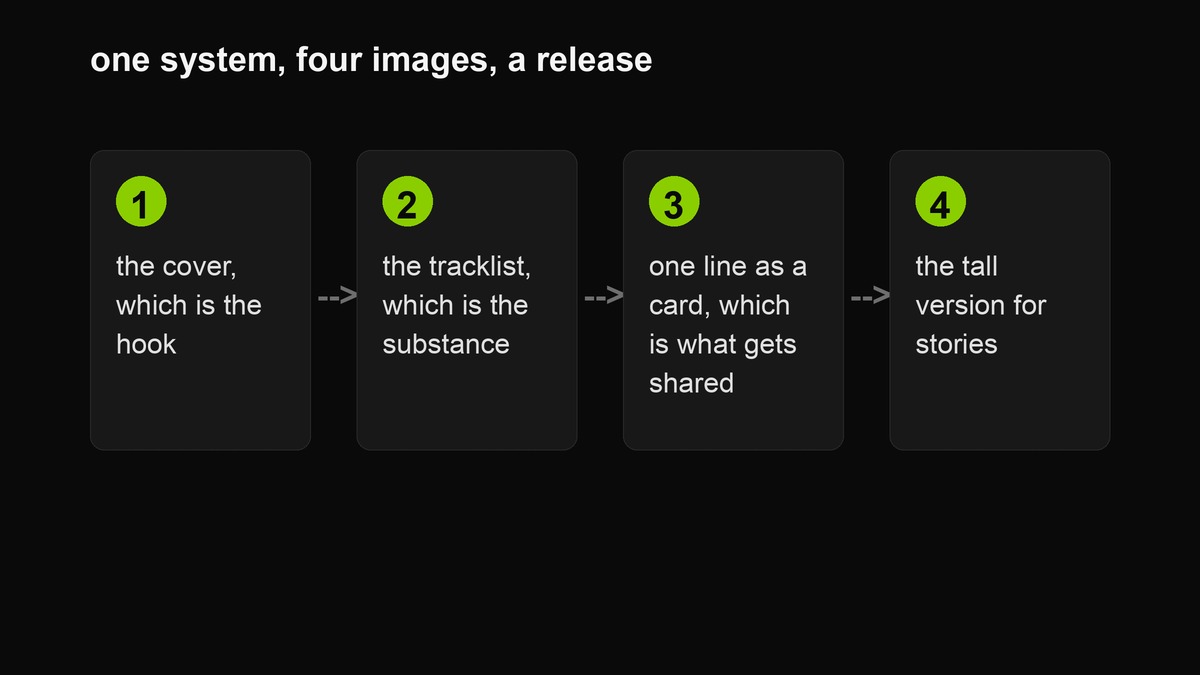 Four images, one system, and a release that looks like an event rather than a file upload.
A tracklist is one piece of a small set. Cover first — the hook. Tracklist second — the substance. A single line from one song as a card third — the quote people will actually share. A tall version for stories fourth — because the vertical surfaces are where the attention is. Same colourway, same type treatment across all four, and the set reads as a release rather than as four separate posts.
The reason this works is unglamorous: repetition of a system is what makes small accounts look professional. Not budget, not skill — the same green, the same weight, the same margins, four times.
Playlists, mixtapes and everything else
Nothing about the format is specific to albums. A playlist of twelve songs with a title and a name on it is a small artefact people will screenshot. A reading list formatted like a record is a genuinely good post. A wedding playlist, a gym set, a road trip — all of them benefit from the same treatment, which is a list of things you like presented as though it mattered. That is the joke and also the point.
The copyright line
Track titles are not copyrightable, and listing songs you wrote is nothing to think about. What you should not do is paste lyric lines into the fields — those are somebody’s writing, and the format makes them look like yours. Same for reproducing a real release’s back cover, or using an artist’s name on something they did not make. The quote card maker has the longer note on where that line sits, and it is the same line here.
Accessibility: the list is text
A tracklist rendered as an image is invisible to a screen reader, to search, and to anyone who copies the text out to send it to a friend. That is not a reason not to make the image — the image is what gets shared. It is a reason to put the same list in the caption or the post body as plain text, formatted as a numbered list, so the information exists in a form that can be read by more than eyes.
Two habits follow. Keep the alt text on the image descriptive rather than duplicative — “tracklist for an album titled X, fourteen tracks, black type on lime green” tells a screen-reader user what the image looks like and lets the caption carry the actual list. And check your own contrast: a decorative colourway that drops below the large-text threshold is a tracklist nobody reads, which defeats the entire purpose of the object.
Common mistakes
- Numbers and titles with equal spacing, so the list reads as two columns.
- Titles long enough to wrap, which breaks the vertical rhythm.
- A different colourway from the cover, which reads as a different project.
- Sixteen tracks on a square canvas, which shrinks the type until nobody reads it.
- Links and hashtags baked into the image, which is designing for a screenshot you will never get.
The test that settles everything
Print it, or shrink it until it is the size of a phone screen, and hand it to someone who has never heard the record. Ask them to read it out loud. Wherever they stumble, the spacing is wrong. Wherever they stop, a title is too long. Wherever they ask “what is this one about,” you have made them curious, which is the only thing a tracklist can actually achieve.
Everything else on this page is detail. A list of songs that makes a stranger want to hear them is a good design no matter what colour it is in.
Make the list, shrink it, hand it to someone, and watch where their eyes go. That is the whole review process, and it costs nothing.
FAQ
Can I use real song titles from other artists?
A list of titles you did not write, presented as a tracklist, is a playlist — which is fine and honest. What you should not do is put someone else’s song titles under your name, which is not a design problem.
How many tracks is too many?
Fourteen on this canvas. Beyond that, split it into two images or two releases, both of which look more considered than a list that runs off the bottom.
Should I include durations?
Only if they say something. A 41-second interlude is information. A column of nearly identical three-minute numbers is noise.
Does it work as a story tile?
Use the portrait canvas and keep it to ten lines. The vertical format is read at arm’s length for two seconds, so it needs to be a teaser rather than the full list.
Should the tracklist match the cover exactly?
Same colourway and same type treatment, yes. Same layout, no — a cover and a back cover that are identical except for the words look like a template with a find-and-replace run over it. Keep the system and change the composition: the cover is one line centred, the list is fourteen lines left-aligned, and that difference is what makes the pair look made rather than generated.
Can I use it for a live show or an event?
Yes, and it works well. Swap track numbers for set order, put the date where the artist name goes, and you have a gig poster that is legible at story size. The format is a list of things in order, which is most of what an event announcement is.
Is anything stored?
No. The list is drawn in your browser and the PNG is assembled locally. Close the tab and it is gone — which is the correct behaviour for a tracklist of an album you have not announced yet.
Related: the tracklist maker, the consistency guide for holding one system across a release, and the platform guide for the sizes the set needs.