
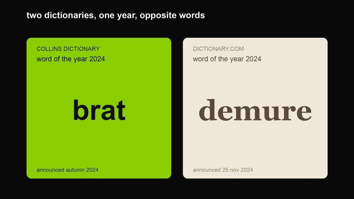
In 2024 the internet ran itself a personality test and split straight down the middle. One half was loud, lowercase and green; the other was quiet, serif and beige. The strange part is that both sides won. Two different dictionaries each crowned one of these words as their word of the year for the same twelve months — Collins picked brat, Dictionary.com picked demure. That is not a coincidence and it is not a tie. It is the clearest possible statement of the argument this page is about: two ways of showing up online that make opposite bets about how much of yourself you should admit.
This is not a colour contest or a font contest. Plenty of people treat it like one and get it wrong, slapping acid green on a caption and calling it brat, or typing in a serif and calling it demure. Neither works, because in both cases the visual style is the output of a posture, not the posture itself. Get the posture right and the look follows almost automatically. Get it wrong and you get a beige post that reads as boring or a green post that reads as a marketing team having a party. Below is the honest version of the comparison: what each one actually is, where each one came from, where each one is lying to you, and — the useful part — which one your specific post should be.
What each one is, and where it actually came from
Brat started as an album. Charli XCX released her sixth record, brat, on 7 June 2024 through Atlantic Records; it debuted at number three on the Billboard 200 and became her highest-charting album. The cover is the whole aesthetic in one image: a flat acid-green square with the word brat in lowercase Arial, deliberately blurred — a softness that survived into the final artwork because of a low-resolution export error, not despite it. The designer behind it, Brent David Freaney, and creative director Imogene Strauss went on to win Best Recording Package at the 2025 Grammys for the thing that looks like nobody proofed it. That tension is the point: it is extremely calculated to look uncalculated.
The attitude matters more than the artwork. Charli described brat herself, in interviews that got quoted everywhere, as that person who is “a little messy and likes to party and maybe says some dumb things sometimes,” who “feels herself, but then also maybe has a breakdown, but kind of parties through it” — honest, blunt, a little volatile. It is oversharing as a stance. When Kamala Harris became the Democratic candidate that July, Charli posted “kamala IS brat” and the campaign rebuilt its social presence in the same lime green and the same Arial, which tells you how far the vibe had travelled beyond music fandom in about six weeks.
Demure started with a makeup tip. On 2 August 2024 a Chicago creator, Jools Lebron, posted a video explaining how she does her makeup for work: “very demure, very mindful.” The phrase — modest, considered, restrained, a little ironic and a little sincere at once — went enormous. NASA and the White House account used it, Jennifer Lopez did a version of it, brands from SSENSE to Maybelline to Marc Jacobs rebuilt their captions around it. Where brat is the 2am thought you send without rereading, demure is the thing you write carefully and then decide not to post. Dictionary.com named “demure” its word of the year for 2024 on 25 November, and the press coverage framed it almost explicitly as the pendulum swinging back from brat summer — “demure fall,” “mindful autumn.”
The real difference is how much you admit
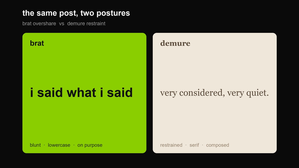
Hold the two side by side and the axis is obvious once you name it. Brat is an overshare. Its whole appeal is the absence of a filter: you get the contradiction, the mess, the unflattering honesty, and the joke lands because it was not workshopped. Demure is a withhold. Its appeal is the visible presence of a filter: you get the considered version, the one that has been edited down to “very mindful,” and the calm reads as competence precisely because you can tell other things were left out.
That single difference generates every surface trait people argue about. The lowercase happens because capitalising looks like you are trying, and trying is un-brat. The serif happens for demure because a serif looks like someone with standards chose it for you. The acid green is aggressive and cheap and screen-loud, which is what an overshare wants; the cream and taupe are quiet and expensive-looking, which is what a withhold wants. None of those choices are the cause. They are all downstream of the one decision: reveal or restrain.
Field by field
The table below is the mechanical version. Read it as a checklist, not a costume — you do not get to be brat by choosing the left column, any more than you get to be demure by choosing the right. You pick a posture and then these fall into place, or you pick the fonts and the posture stays fake and everyone can tell.
| Field | Brat | Demure |
|---|---|---|
| Capitalisation | All lowercase, including names and the start of sentences | Correct sentence case; the neatness is the signal |
| Type | Arial or Helvetica; blur and low-res are features | A serif (Georgia, Times) or a calm geometric sans; crisp |
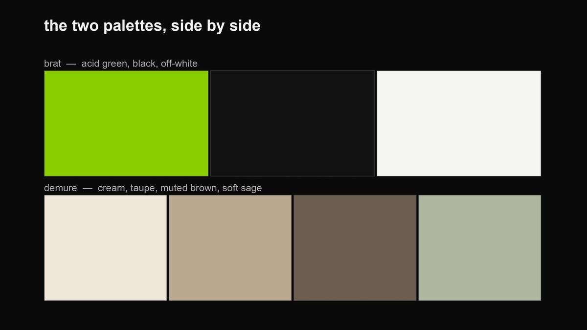
| Palette | Acid green #8ACE00, black, off-white | Cream, taupe, muted brown, soft sage |
| Punctuation | Full stops used for deadpan; no exclamation marks | Commas and periods, even cadence, nothing raised |
| What you reveal | The mess, the contradiction, the 2am thought | The edited highlight; the version that has been considered |
| What you withhold | Nothing, on purpose — or so it claims | The effort behind the ease |
| Best moment | Late night, weekend, around an event | Weekday morning, professional hours |
| The risk it runs | Reads as try-hard, or a brand cosplaying chaos | Reads as smug, cold, or quietly passive |
| How it ages | Now a period reference (summer 2024) | Already faded (autumn 2024) |
Where each one is lying to you
Both aesthetics sell a story about themselves that is not quite true, and you should not buy the marketing from either side.
Brat claims not to care, which is its most expensive-looking lie. The album cover won a Grammy. The blur was a mistake that was then studied, refined and reproduced at scale. “I said what I said” is, in practice, a lot of people saying a great many things very carefully before deciding which one to pretend they blurted. That is fine — all cool looks this engineered — but if you think brat means you can post sloppily and it will read as confident, you will just read as sloppy. The looseness is the hard part, not the free part.
Demure claims modesty, which hides its own performance. “Very mindful” is a decision about what not to show, and a reader can feel the editing even when they cannot name it. The failure mode is that restraint curdles into smugness: the calm starts to look like you think you are better than the people still oversharing, or like you have nothing to say and have dressed the silence in a serif. Demure only reads as competence when there is something real behind the composure. If the considered version is considered because there was nothing to say, people clock it.
When to use brat
Brat is the right call when the job of the post is to be remembered and passed around, and when you can actually carry the posture without it looking rented. Concretely: you are promoting a release, a party, a drop, or anything with a countdown; your audience is young and lives online; your brand voice is “one of us, not above you”; you are leaning into a joke, a meme, or a callout; or you would rather be screenshotted than quoted respectfully. Brat is a memorability machine. It is built for the double-tap and the share, and it is genuinely good at nothing else. If your metric is “did anyone repeat this,” brat wins.
When to use demure
Demure is the right call when the job of the post is to be believed, and especially when the content is fragile. Use it for an apology, a delay, a price increase, a layoff, a safety note, or anything where oversharing would look like you do not understand the stakes. Use it when you sell something considered or expensive, when the reader is a professional opening your post during working hours, when you are rebuilding trust rather than spending it, or when being taken seriously matters more than being shared. Demure is a credibility machine. It is built for the reader who decides whether to trust you, and it trades reach for that trust on purpose.
Where each one should not be used
The fastest way to get this wrong is to pick the aesthetic that flatters you instead of the one the situation demands. Do not go brat on anything sensitive — an apology in acid green lowercase is a brand asking to be screenshotted for the wrong reason, and the joke reads as not caring about the thing people are upset about. Do not go brat if you do not have the standing to pull it off; chaos is a costume that fits some people and not others, and a stiff account wearing it just looks stiff in green. Do not go demure if you are a party, music or youth brand, because composure is exactly the energy you are trying to kill — a demure nightclub announcement is a contradiction. And do not go demure to hide that you have nothing to say; restraint with no substance is not mindful, it is empty.
The one-question decider
If you only take one tool from this page, take this. Before you write, ask: do I want to be quoted, or do I want to be trusted?
Brat is built to be quoted — passed around, screenshotted, repeated, memed. It wins on memorability and it is happy to trade a little credibility to get it. Demure is built to be trusted — read carefully, believed, filed under “this person has standards.” It wins on credibility and it is happy to trade reach to get it. Almost every post can be sorted by which side of that line it is on. A product launch with a date on it is a quote problem: go brat. A post explaining why the product is late is a trust problem: go demure. Once you know which currency you are spending, the fonts and the colours stop being a decision at all — they fall out of the answer.
Can you run both, or mix them
Yes, and the mix has a name — “very brat, very mindful” — and a shelf life. The crossover works as a single self-aware joke: a brand that is normally composed posting one deliberate mess, or a normally chaotic account posting one considered thing, and the gap is the humour. That is a legitimate move. What does not work is being sincere about both at once in the same post, because the two postures are defined by opposite answers to the reveal-or-withhold question, and a post that both overshoots and holds back just reads as confused. If you want to run both on one account, run them as a rhythm across many posts — mostly one, occasionally the other, never the same paragraph. The contrast is the whole value; flatten it and you have neither.
How each one ages, from here
Both of these are now period pieces, and pretending otherwise will date you faster than the aesthetic itself. Brat peaked in the summer of 2024; demure crested a few weeks later in August and was visibly fading by that autumn. So if you reach for either today, you are not starting a trend — you are quoting one, the way a Y2K revival quotes 1999. That is allowed and can even be smart, but it has to be a knowing reference, not a genuine attempt to be current, because the internet remembers exactly when each of those words won its dictionary and will place you the second you miss. The safe reading is that brat now carries a wink of nostalgia and a little irony; demure carries less, and risks reading as simply “clean” to anyone who was not there for the joke. Choose accordingly.
Making the brat side with the tools on this site
This site builds brat things, so the practical half is lopsided on purpose. If you have decided you want the brat side, the generator gives you the cover — the real field it paints is a slightly softer green than the #8ACE00 quoted in most write-ups, and the examples page shows the exact values under each output. The green colour tool pulls the hex and its neighbours if you are matching a palette, the caption generator is for the lowercase deadpan voice specifically, and the font and logo tool is where the deliberate blur lives. There is no demure generator here, and that absence is honest: demure is not a thing you generate, it is a thing you do by taking tools away and editing down. If you have chosen demure, the useful action is to open a plain document, write the whole messy version first, and then delete most of it. That is the entire craft.
FAQ
Are brat and demure the same as minimal and maximal?
No, and mixing up the axis is the common error. Minimal versus maximal is about how much is on the canvas — a design decision. Brat versus demure is about how much of you is in the post — a posture decision. You can make a sparse, minimal image that is fully brat (one lowercase line on green is both minimal and a loud overshare), and a busy image that is demure. The brat vs minimal guide covers the density axis; this page covers the honesty axis.
Which one gets more engagement?
Brat, more often, and for the obvious reason: it is engineered to be shared. But engagement is not the only thing a post can be for. If the metric that matters is whether a specific person trusts you enough to buy, hire, or believe you, demure routinely beats brat while posting worse on the raw numbers. Ask what the post is for before asking what it earns.
Can a business use brat without looking like it is trying too hard?
Sometimes, and the test is whether you would still find it funny if a competitor made it. A brand posting brat chaos is wearing a costume borrowed from an artist and a creator; it works when the brand already has a personality that could plausibly say the dumb thing, and it fails when a faceless company discovers lowercase. If you have to ask whether you can get away with it, you usually cannot.
Is demure just corporate beige?
It is the risk, not the definition. Good demure is specific and quietly confident — a considered line, a real point of view left unstated because it is obvious to the reader. Corporate beige is demure with the substance removed, which is why it reads as safe and blank. The difference is whether there is something behind the restraint.
Do I have to pick one?
Per post, yes — the two postures answer the reveal-or-withhold question differently and a single post cannot honestly answer it both ways. Across an account, no. The best accounts have a dominant posture and let the other one show up occasionally for contrast, because the rare switch is what makes each mode legible.
Where the facts on this page come from
- Charli XCX, brat — released 7 June 2024 (Atlantic Records), debuted number three on the Billboard 200. Encyclopaedia Britannica.
- Cover design by Brent David Freaney with creative director Imogene Strauss; the blur survived a low-resolution export error; Best Recording Package, 2025 Grammy Awards. NME.
- Charli XCX’s own definition of “brat” (the “a little messy… has a breakdown, but kind of parties through it” description) — widely quoted from her 2024 press.
- “kamala IS brat” posted 22 July 2024; the Harris campaign rebranded its social presence in brat green. The Guardian, 23 July 2024.
- “brat” named Collins Dictionary Word of the Year 2024 — “characterised by a confident, independent, and hedonistic attitude.” Collins / The Mirror, November 2024.
- Jools Lebron’s “very demure, very mindful” makeup-for-work TikTok, posted 2 August 2024. Time.
- “demure” named Dictionary.com Word of the Year 2024 on 25 November 2024. Dictionary.com / The New York Times.
The scenario verdicts, the “quoted vs trusted” decider and the notes on how each look ages are this site’s own opinion, not sourced claims.
Every graphic on this page was made in-house with the site’s own tools and a small amount of Python. The palettes and type choices shown are representative of each aesthetic, not official brand specifications.