
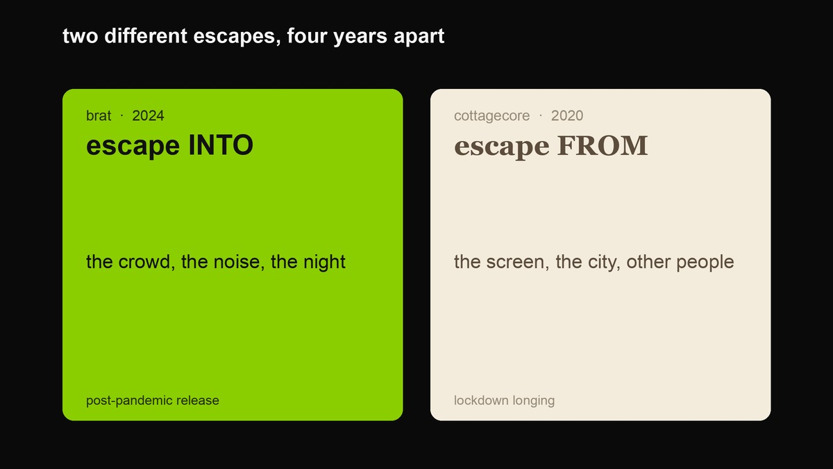
Brat and cottagecore look like nothing could be further apart — one is a screaming acid-green square about staying out too late, the other is a soft-focus photo of bread cooling on a windowsill. But they are the same feeling wearing two opposite costumes. Both are escapism. Both are a group of people saying “I do not want to be where I actually am.” The only difference is the direction they run: cottagecore wants to escape from other people, from the city, from the screen; brat wants to escape into them. Get that one axis and the whole comparison sorts itself out — the palettes, the fonts, the time of day, the kind of brand each one fits. This page is the honest version of that, ending in something you can actually use: which one your specific post should be.
What each one is, and where it actually came from
Brat is the aesthetic that came off an album. Charli XCX released brat on 7 June 2024 through Atlantic Records; it debuted at number three on the Billboard 200 and became her highest-charting record. The look is the cover: a flat acid-green square, the word brat in lowercase Arial, deliberately blurred — a softness that survived into the final artwork because of a low-resolution export error. The designer, Brent David Freaney, and creative director Imogene Strauss won Best Recording Package at the 2025 Grammys for the thing built to look like nobody checked it. It is nightlife and overshare and Y2K-rave energy, and it had such a grip on the summer that when Kamala Harris became the Democratic candidate that July, Charli posted “kamala IS brat” and the campaign rebuilt its socials in the same lime and the same font. Collins Dictionary made “brat” its word of the year for 2024.
Cottagecore is the aesthetic that came off a lockdown. The word had been circulating online since the late 2010s — it was coined on Tumblr — but it exploded in 2020, driven, as Merriam-Webster puts it, by people’s experience of lockdown during the COVID-19 pandemic and the stress of contemporary life and technology. The look is a romanticised English countryside: baking, gardening, foraging, wildflowers, gingham and toile, prairie dresses, soft natural light, a palette of cream, sage, dusty rose and butter yellow. Its pop-culture crest was Taylor Swift’s folklore, a surprise album released on 24 July 2020 that became the best-selling record of the year and won Album of the Year at the 63rd Grammys; Swift is widely credited both with embodying cottagecore and with pushing it mainstream. Where brat is a crowd, cottagecore is a single person who has finally been left alone.
The real difference is which way you want to run
Name the axis and the noise stops. Cottagecore is withdrawal: away from the city, away from other people, away from the screen, toward slowness, nature, and a hand-made quiet. Brat is immersion: toward the city, toward the crowd, toward the screen and the noise and the small hours. They are not opposites in taste so much as opposites in appetite — one is hungry for less of the modern world, the other is starving for more of it. That is why they can look so alien next to each other and still be doing the same job: offering a door out of the present.
Once you see it as direction rather than decoration, every surface choice makes sense. Cottagecore goes soft and pale because calm is the point; brat goes acid and loud because stimulation is the point. Cottagecore reaches for a serif because a serif looks inherited and unhurried; brat reaches for Arial because Arial looks like nobody chose it. Cottagecore photographs daylight and hands and plants; brat photographs a flat colour field and a single blunt sentence. None of this is about colour preference. It is about whether you are running toward the party or away from it.

Field by field
The mechanical version, as a checklist and not a costume. You do not get to be cottagecore by adding a mushroom, any more than you get to be brat by holding down the shift key. Pick the direction first; these follow, or they look like a theme park.
| Field | Brat | Cottagecore |
|---|---|---|
| Setting | Club, city street, bathroom mirror at 2am | Cottage, garden, kitchen, meadow |
| Time of day | Night, and the weekend | Morning, and the golden hour |
| Light | Screen-loud, flat, or harsh flash | Soft, warm, natural, sun-dappled |
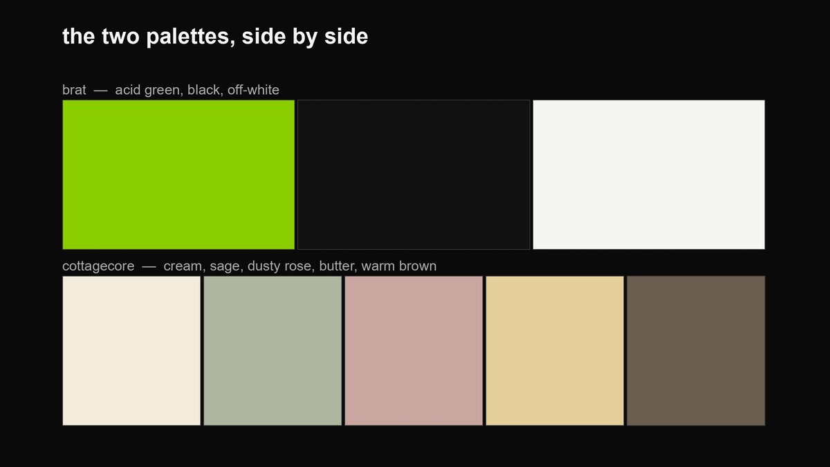
| Palette | Acid green #8ACE00, black, off-white | Cream, sage, dusty rose, butter, warm brown |
| Type | Arial or Helvetica, lowercase, blurred on purpose | A serif or a hand-written script, unhurried |
| Imagery | Text as image; one blunt line, no decoration | Plants, food, hands, fabric, animals, weather |
| Soundtrack energy | Club, hyperpop, loud and fast | Folk, ambient, birdsong, slow |
| What it longs for | More — more people, more night, more feeling | Less — less noise, less screen, less rush |
| What it avoids | Looking like you tried, or like you care what people think | Modernity itself: the city, the machine, the crowd |
| The risk it runs | Reads as try-hard, or a brand cosplaying chaos | Reads as naive, twee, or a fantasy that never existed |
| How it ages | Now a period reference (summer 2024) | Already retro (peaked 2020–21) |
Where each one is lying to you
Both aesthetics sell a story about themselves, and both stories are quietly false in opposite directions.
Brat claims not to care, which is its most expensive lie. The cover won a Grammy; the blur was a mistake that was studied and reproduced at scale. The whole pose is “I said what I said,” but getting to look that effortless takes a surprising amount of craft, and if you think brat means posting sloppily, you will just look sloppy rather than confident.
Cottagecore claims to be simple, which is its own kind of fantasy. It is not actually a return to rural life; it is a rose-tinted image of one, edited until the hardship is gone. The real history of country living is cold, back-breaking, and frequently lonely, and the aesthetic quietly deletes all of that to sell a mood — a point critics of the whole “-core” economy have made, noting that these micro-trends mostly function to push consumption and file people into neat little boxes. That does not make cottagecore worthless, but it does mean you should not mistake it for a lifestyle. It is a filter. The bread in the photo took four tries and a ring light.
When to use brat
Use brat when the job is energy and you can carry the pose without it looking rented. It fits a release, a party, a drop, a countdown, a meme, a callout, or anything that should feel fast and a little reckless. It fits a young, online audience and a brand voice that wants to be “one of us, not above you.” It fits the late-night post and the weekend post. Brat is an activation switch: you use it when you want people to feel pumped and to share. If the goal is to make a thing feel like it is happening right now and you should be there, this is the one.
When to use cottagecore
Use cottagecore when the job is comfort and the subject is slow, natural, or handmade. It fits food and baking, wellness, skincare, sustainability, home and craft, weddings, children’s products, small-batch and artisan goods, gardening, and anything that wants to feel gentle and unhurried. It fits the weekday-morning post and the seasonal post. Cottagecore is a soothing switch: you use it when you want the reader to exhale. If the goal is to make a thing feel warm, wholesome and a little nostalgic, this is the one — and notice how many of those categories are products people buy online for a hit of calm, which is exactly the feeling the aesthetic is built to sell.
Where each one should not be used
The fastest way to get this wrong is to pick the aesthetic that flatters you instead of the one the situation needs. Do not run cottagecore for anything that should feel sharp, modern or urgent — a fintech app, a nightclub, a breaking-news statement dressed in gingham reads as either a joke or a denial. Do not run brat for anything gentle or sincere — a bakery, a wedding, a condolence or a children’s product in screaming acid lowercase is just noise, and the wrong kind. And watch the specific landmines: cottagecore tips into twee or naive the moment it loses self-awareness, and it can read as tone-deaf nostalgia for a past that was harder than it looked; brat tips into try-hard the moment the brand behind it does not actually have a personality. If you have to ask whether you can get away with either, you usually cannot.
The one-question decider
If you take one tool from this page, take this. Before you write, ask: do I want my reader pumped or soothed? Brat is built to raise your pulse — it is the post that makes someone want to go out, buy the drop, join the thing, screenshot the joke. Cottagecore is built to lower it — it is the post that makes someone want to stay in, make something, slow down, order the candle. Almost every post can be sorted by which end of that dial it is trying to move. A ticket launch is a pulse problem: go brat. A new seasonal menu or a self-care product is a calm problem: go cottagecore. Once you know whether you are turning the volume up or down, the colours and the fonts stop being decisions — they fall out of the answer.
Can you mix them, or is that just goblincore
The honest answer is that the mash already exists and it is doing something different from either parent. The soft-cottage palette plus brat’s chaos lives in adjacent aesthetics — goblincore, “feral cottage,” the moss-and-mushroom-and-mud end of cottagecore that admits nature is gross. You can absolutely borrow from both in one post, but you cannot be sincere about both directions at once, because the whole distinction is toward-the-crowd versus away-from-it, and a single post cannot run both ways. Where the mix works is as a specific joke or a specific niche: a brand that is cozy by default posting one deliberate brat mess, or a party brand doing one self-aware cottagecore bit. Where it fails is the middle ground — a beige-and-green post that wants to be both calming and loud and lands as neither.
How each one ages, from here
Both of these are now period pieces, and the two are dated differently. Cottagecore crested in 2020 and 2021 and has been quietly retro since — reach for it today and you are invoking a specific lockdown-era nostalgia, which can read as warm or as “this brand is behind,” depending on how knowingly you do it. Brat is the newer artifact, summer 2024, and it still reads as a recent reference rather than a vintage one, though that window is closing. The practical rule is that cottagecore is now the safer of the two to use unironically, because its whole language was already nostalgic and a little out-of-time; brat is riskier to use straight, because it was built on being current, and quoting “current” from a year or two ago is the one thing it was never supposed to look like. Know which clock each one is running on.
Making the brat side with the tools on this site
This site builds brat things, so the practical half is lopsided on purpose. If you have decided you want the brat side, the generator gives you the cover — the real field it paints is a slightly softer green than the #8ACE00 quoted in most write-ups, and the examples page shows the exact values under each output. The green colour tool pulls the hex and its neighbours, the caption generator is for the lowercase deadpan voice, and the font and logo tool is where the deliberate blur lives. There is no cottagecore generator here, and that is honest rather than a gap: cottagecore is not a thing you generate, it is a thing you shoot, light and edit — soft daylight, real textures, muted colour. If you have chosen cottagecore, the useful action is to close this tab and go take a photo near a window. The one place these tools still help is the palette tool, if you want to sample the sage-and-butter tones off a reference image rather than guess them.
FAQ
Is cottagecore problematic?
It has been criticised on two fronts, and both are fair to know before you lean on it. The first is that it sells an idealised rural past that smooths over real hardship and, in some readings, a very whitewashed one. The second is the broader “-core” complaint that these named micro-aesthetics exist mainly to drive consumption and sort people into boxes. Neither means you cannot use the look — it means you should use it as a mood you are knowingly reaching for, not as a claim that you live some pure pastoral life.
Which one is easier to pull off?
Brat is easier to fake and harder to earn; cottagecore is harder to fake and easier to earn. Anyone can type a lowercase line on green, which is exactly why most brat posts from brands look like a marketing team having a party. Cottagecore is harder to fake because it depends on real photography and materials — the light, the bread, the fabric — but if you genuinely make or grow something, the aesthetic is honest by default.
How is this different from brat vs minimal?
Minimal is about how much is on the canvas — a density decision. Cottagecore vs brat is about which way you want to run — a mood and setting decision. You can make a minimal image that is fully cottagecore (one mushroom on cream) or fully brat (one word on green). The brat vs minimal guide covers the density axis; this page covers the escape axis.
Can a city brand use cottagecore?
Yes, and it is often the interesting version — the point of cottagecore for most people is that they do not live in a cottage, so it works as longing rather than biography. A city bakery or a small apartment plant shop can lean into it honestly because it is selling the feeling of the thing, not the thing. What does not work is pretending the brand is rural when it is not; that is where the naivety critique bites.
Do these overlap with coquette, farmhouse, or grandmillennial?
Heavily, and that is a warning sign as much as a shortcut. Coquette adds bows and hyper-femininity; farmhouse is its cleaner, more commercial cousin; grandmillennial is the thrift-store, old-lady-cozy end. They share cottagecore’s soft palette and nostalgia, which means if you reach for cottagecore you are stepping into a crowded, already-familiar visual space. The way out is specificity — a real product, a real place, a real hand — not a bigger pile of florals.
Where the facts on this page come from
- Charli XCX, brat — released 7 June 2024 (Atlantic Records), debuted number three on the Billboard 200. Encyclopaedia Britannica.
- Cover design by Brent David Freaney with creative director Imogene Strauss; the blur survived a low-resolution export error; Best Recording Package, 2025 Grammy Awards. NME.
- “kamala IS brat” posted 22 July 2024; the Harris campaign rebranded its social presence in brat green. The Guardian, 23 July 2024.
- “brat” named Collins Dictionary Word of the Year 2024. Collins / The Mirror, November 2024.
- Cottagecore — “in use online since the late 2010s, and spread in popularity in 2020, driven by people’s experience of lockdown during the COVID-19 pandemic.” Merriam-Webster.
- Taylor Swift, folklore — surprise release 24 July 2020, best-selling album of 2020, Album of the Year at the 63rd Grammy Awards; credited with fuelling cottagecore. Merriam-Webster / Republic Records.
- Critiques of “-core” aesthetics as consumption-drivers and of cottagecore as rose-tinted escapism. Varsity (2024); Adobe Stock 2021 trend report; The New York Times, March 2020.
The scenario verdicts, the “pumped or soothed” decider and the notes on how each look ages are this site’s own opinion, not sourced claims.
Every graphic on this page was made in-house with the site’s own tools and a small amount of Python. The palettes and type choices shown are representative of each aesthetic, not official brand specifications.