
A band reaches for the brat look for honest reasons: it costs nothing, it needs no designer, it carries a DIY and club and punk lineage that fits a lot of music, and — crucially — a flat field with one bold word still reads when your album is a 60-pixel square in a phone list. That last point is why the aesthetic won on streaming platforms specifically. But the same qualities make it the easiest brat cover to get wrong: because anyone can make a green square with a name on it, a generic one looks like a template, and a template on a release date looks like a band that did not think about its own record.
This is the band version of the guide — not “type your name on green,” which you can do in ten seconds, but the decisions that separate a cover that fits your record from one that could sit on any band’s EP. It covers when the look suits you, the anatomy, the one genuinely tricky part (the blur versus what Spotify and Apple will actually accept), the real technical specs, and how to make the whole thing with the tools on this site. The judgement calls are mine and are flagged as such; the platform numbers are sourced at the bottom.
First: does brat fit your band at all?
Be honest before you open a generator. Brat is lowercase, unpolished, confrontational and a little ironic. That vocabulary is a natural fit for hyperpop, electronic, indie-dance, punk, rap, club, DIY and a lot of shoegaze — music that already performs a kind of careless confidence. It is a poor fit for folk, metal, orchestral, trad jazz, or any sound whose whole promise is craft and warmth; a acid-green lowercase block on a string quartet reads as a joke at the exact moment the music is asking to be taken seriously. This is a judgement call, not a rule — but if your band’s appeal is sincerity and texture rather than attitude and volume, the look will fight you.
The test I would apply: does your music already have a “we do not care what you think” frequency? Brat amplifies that frequency. It cannot manufacture it. If the answer is no, borrow one element (the lowercase wordmark, the flat field) rather than the whole identity.
The anatomy of a brat cover
Strip a real one down and there are four parts, and the discipline is in what is not there.
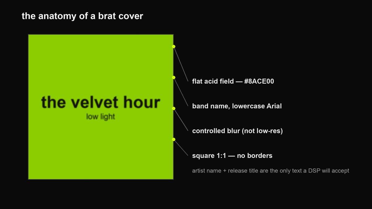
- The field. One flat, saturated colour — the acid green
#8ACE00(or the softer#8BDC65this site’s generator actually exports; the colour codes page lists both). No gradient, no texture, no photo. The emptiness is the statement. - The wordmark. The band name and title in lowercase Arial or Helvetica. Lowercase is not a cute default — it is the anti-logo gesture, the refusal to brand.
- The blur. A controlled softness on the type. This is the part with a trap in it, and it gets its own section below.
- The square. One-to-one, edge to edge, no border, no frame.
The blur paradox — the one thing bands get rejected for
Here is the tension nobody warns you about. The brat cover’s blur is famous precisely because it was an accident — the original album artwork kept its softness after a low-resolution export error, and the look was built on top of that mistake. But the platforms that will host your record actively reject low-resolution artwork: Spotify tells artists not to upscale, and Apple rejects unintended blur and pixelation. So the amateur version — squish a tiny JPEG until the name goes mushy and call it brat — is exactly what gets a release bounced.
The fix is to separate the two things the eye confuses. Build the master at full resolution (3000 to 4000 pixels square, crisp text), and apply the blur as a deliberate, even style on that crisp master — a soft edge you chose, not a file that ran out of pixels. The difference survives zooming: a styled blur is uniform and the letterforms are still present underneath; a low-res blur is blocky and the type is genuinely gone. Ship the high-resolution file. The look reads as a choice, the platform reads it as clean, and you get both.
Single, EP, album, poster — same look, different jobs
The technical requirements are identical for a single, an EP and an album — the file is a square image either way — but the strategy differs, and a gig poster is a completely different animal that ignores the streaming rules entirely.
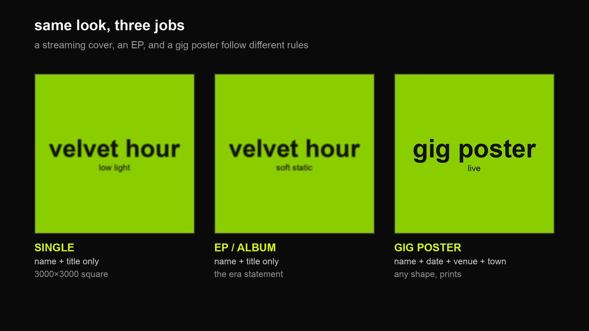
- Single. The most experimental slot. You might release six a year, so a single is where you can try a colour, a blur level or a layout and change it next time.
- EP / album. The statement piece — the image people will attach to this era of the band. Make it the one you are willing to put on a vinyl sleeve, because you probably will.
- Gig poster. Not bound by platform rules. It needs the date, the venue, the town and the support, and it can be portrait, printed, and covered in type. Keep the same field and wordmark so it is recognisably your band, then do whatever a poster needs.
The spec sheet (the real numbers)
These are the platform rules that actually cause rejections. If you make one file that satisfies all of them, you never think about it again.
| Requirement | What to do |
|---|---|
| Dimensions | A 3000 × 3000 px square master satisfies essentially every major platform; design at 4000 and export at 3000. Spotify accepts roughly 1400 up to 8000 px; Apple wants high resolution and rejects upscaling. |
| Aspect ratio | Perfectly square, 1:1. Even a one-pixel difference, or any border or letterbox, can trigger rejection. |
| Colour & format | RGB / sRGB. High-quality JPG is the safe common denominator — Deezer in particular only takes JPG, not PNG. |
| Text allowed | Artist name and release title, nothing else. “Out now,” release dates, “featuring,” social handles, emails and URLs are all rejection triggers. |
| Quality | No unintended pixelation or blur, no heavy compression artefacts — which is the trap in the section above. |
| Badges | Do not add your own “Explicit” label; platforms apply it from your content tags. |
| Content | No other artist’s likeness and nothing implying an endorsement that does not exist. |
The thumbnail test
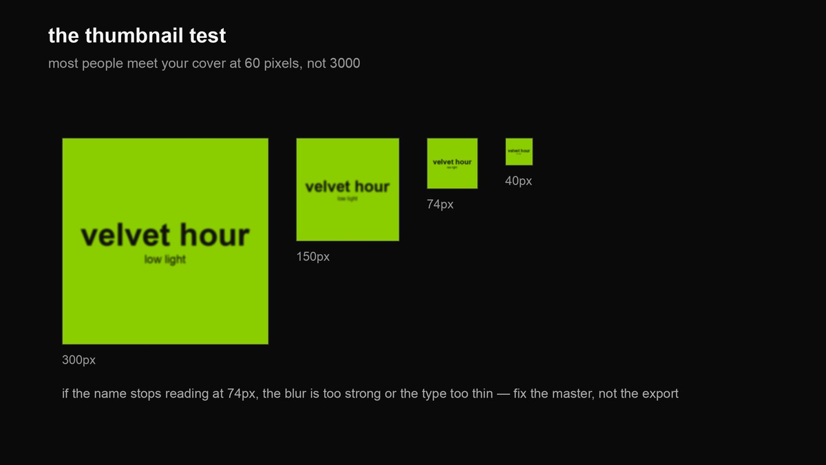
Before you call a cover done, shrink it. Most people will meet your record at the size of an app icon, not a poster, and a brat cover lives or dies there. If the band name stops reading at around 74 pixels, the blur is too strong or the type too thin — and the fix is the master, not the export.
The line matters more than the green
Once you accept that the field and the font are basically fixed, the only real creative decision left is the words — the band name and the title — and how they are phrased. This is where a lot of band covers fall flat: the name is fine but the title is a dead cliché, or the capitalisation gives the whole game away. Brat voice is lowercase, deadpan, and uses a full stop as a tone marker rather than grammar. “low light.” is a title; “Low Light!!” is a different band. There is a whole guide to writing the line itself in how to write a brat poster line, and if you want caption ideas for the announcement posts around the release, the caption library covers that.
Making the whole thing with the tools here
Every step below runs in the browser, no upload, no account.
- The cover. The generator gives you the field and the lowercase wordmark at the size you set; the exact green (and its neighbours) are on the colour codes page, and the gallery shows real outputs with their settings so you can copy a look that already works.
- The blur. The font and logo tool is where the deliberate softness lives — apply it to a crisp, large export, not a small one.
- Every size you need. The social template maker exports the same design across the ratios a release needs — square for streaming, portrait for stories, wide for a banner.
- The back cover / tracklist. The tracklist maker turns your running order into a matching image for the back of the EP or a carousel slide.
- Merch. The sticker maker exports a true-alpha PNG of the wordmark for a tote, a sticker sheet or a stage backdrop.
Merch and the physical version
The brat cover translates unusually well to merch because it is already a flat graphic with one bold mark — the same thing a tote or a sticker needs. Two practical notes. First, a digital cover is not a print file: vinyl and CD packaging use a manufacturer template with its own dimensions, bleed, safety zones and a spine, and print in CMYK rather than the RGB you exported for streaming. Keep the same artwork but rebuild it against the pressing plant’s template. Second, the acid green is a hard colour to hit in ink — it is brighter than most CMYK gamuts can produce — so expect the printed green to sit slightly duller than the screen, and proof it before a run.
The rights question, honestly
The aesthetic itself — a bright green field, a lowercase sans-serif word, a soft blur — is not anyone’s property, and you can make a brat cover for your band without asking permission. What you cannot do is reproduce the specific Charli XCX brat artwork or anything close enough to imply she endorsed you; that is both a rights problem and, separately, a streaming rejection for misleading content. Use the language, not the original sentence. If your release is commercial and going through a distributor, this is the line to stay well inside.
Common mistakes that make it look like a template
- Decorating it. A logo font, a gradient, a border, a photo behind the text — every one of these pushes you back toward the ordinary cover the look was rejecting.
- Capitalising. “VELVET HOUR” is a different statement than “velvet hour.” The lowercase is the point.
- Genuine low resolution. The blur must be a style on a crisp master, or you will be rejected (see above).
- Promotional text. “new single out friday” on the cover is a rejection trigger; save it for the caption.
- Wrong green, badly. A muddy or neon-off green reads cheap. Use a known value from the colour page rather than eyeballing it.
- Too little, too safe. A single short word on green is bold; a paragraph of small text is a flyer. If you need to say a lot, that is a poster or a caption, not a cover.
A worked example
Say a three-piece indie-electronic band, “Velvet Hour,” releasing a debut EP called “soft static.” The decisions: the look fits (electronic, a little cool, a little ironic). Field: #8ACE00. Wordmark: “velvet hour” over “soft static” in lowercase Arial, built at 4000 px, blurred as a style, exported at 3000 px square sRGB JPG. Thumbnail check at 74 px — the name still reads, so the blur is fine. Same wordmark through the sticker tool for a tote and the tracklist tool for the back cover. The gig poster keeps the field and the type but adds the date, the venue and the town, portrait, for print. Nothing in that list is expensive; the whole thing is a set of small, deliberate choices, and that is exactly what separates it from the template.
Before you upload: a 60-second checklist
Run the file through this list before it goes to your distributor, and you will not get bounced.
- Square, 1:1, identical width and height — no border, no letterbox.
- At least 3000 × 3000 px, sRGB, high-quality JPG (not PNG, to keep Deezer happy).
- Text is only the artist name and the release title — no date, no “out now,” no handle, no URL.
- The blur is a style on a crisp master, not a degraded file: zoom to 100% and confirm the letterforms are present.
- Shrink to ~74 px and confirm the band name still reads.
- No other artist’s face, no implied endorsement, no self-applied explicit badge.
- You kept the sharp master somewhere, so you can re-export a clean version later.
FAQ
What size should a brat album cover be?
Make a 3000 × 3000 px square, sRGB, high-quality JPG and it will satisfy essentially every streaming platform. Design larger (around 4000 px) and export to 3000 so you are never upscaling.
Do I have to blur a brat cover?
No — the original blur was an accident, and a crisp brat cover is completely valid and often safer for streaming. If you do blur it, apply it as a deliberate style on a high-resolution master; do not deliver a genuinely low-quality file, which platforms reject.
Can I put the release date or “new single” on the cover?
Not on a streaming cover — promotional text, dates and social handles are rejection triggers. The only text allowed is the artist name and the release title. Put the date on the announcement post or the gig poster instead.
Is it legal to make a brat-style cover for my band?
Yes. The look — green field, lowercase sans, soft blur — is not owned. Do not copy the exact Charli XCX artwork or imply any endorsement, which is both a rights issue and a platform rejection for misleading content.
Will a green cover look right on vinyl and merch?
Expect the printed green to be slightly duller than the screen — acid green is near the edge of what CMYK can produce, so proof before a run. And rebuild the file against the pressing plant’s template; the streaming JPG is not a print file.
Where the numbers and facts come from
- Streaming artwork specifications — 3000 × 3000 px square sRGB as the universal safe master; Spotify roughly 1400–8000 px and a no-upscaling rule; Apple’s rejection of unintended blur and pixelation; perfectly-square 1:1 with no borders; artist name and title as the only permitted text; no promotional text, handles or self-applied explicit badges; Deezer JPG-only. Aggregated from Spotify for Artists and Apple Music artwork guidance and distributor spec pages.
- Print reality — vinyl and CD use manufacturer templates with bleed and CMYK colour, per standard packaging guidance.
- brat origin — Charli XCX, brat, released 7 June 2024 (Atlantic); the blurred cover came from a low-resolution export error; design by Brent David Freaney and Imogene Strauss, Best Recording Package, 2025 Grammys. Encyclopaedia Britannica / NME.
- Colour values —
#8ACE00as the album green and#8BDC65as this site’s generator export, from the brat colour codes reference.
The “does it fit your band” gate, the blur-paradox framing, the worked example and the merch notes are this site’s own judgement, not sourced rules.
Every graphic on this page is an original illustration made in-house with the site’s own tools; the band “Velvet Hour” and the titles used are invented for the example.