
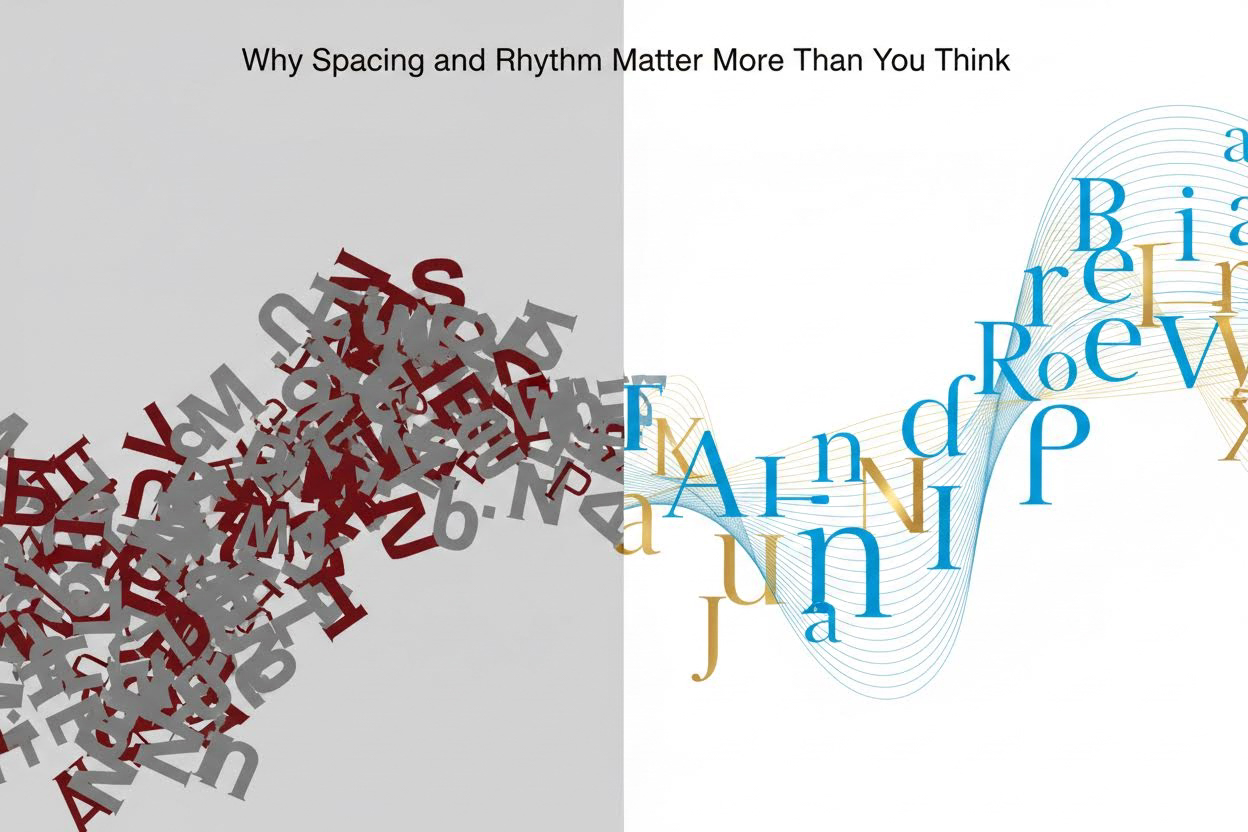
Imagine staring at a wall of plain text that screams “amateur.” Words clump together awkwardly, lines blur into exhaustion, and your message drowns in mediocrity. Now picture that same text breathing—letters dancing with precision, lines flowing like a melody, white space inviting the eye to linger. This isn’t magic from Photoshop; it’s the subtle power of spacing and rhythm. In this guide, you’ll master these typographic principles to elevate any block of text into something that looks professionally designed, using only CSS properties like letter-spacing, word-spacing, line-height, and margins. By the end, you’ll transform bland copy into captivating content that holds attention and boosts readability.
Why Spacing and Rhythm Matter More Than You Think
Typography isn’t just about fonts; it’s about control. Poor spacing creates visual noise, forcing readers to work harder to parse words—studies show this increases cognitive load by up to 20%. Rhythm, meanwhile, mimics the natural cadence of speech, guiding the eye smoothly across the page like a well-composed sentence.
These elements draw from centuries-old printing traditions but shine in digital design. When you adjust spacing, you’re not tweaking pixels; you’re sculpting perception. Rhythm emerges from repetition and variation: consistent line lengths paired with strategic breaks create flow. Master them, and your text gains hierarchy without bold colors or graphics.
Key Takeaway: Great typography respects the reader’s eye. Optimal spacing reduces reflow errors during saccades (rapid eye movements), making text 14% faster to read per the WCAG guidelines on text spacing.
The Building Blocks of Spacing: Kerning, Tracking, and Leading
Spacing starts at the smallest scale. Let’s break it down with actionable techniques you can apply immediately in CSS or design tools.
Kerning: Fine-Tuning Letter Pairs
Kerning adjusts space between individual letter pairs, countering optical illusions where shapes like “AV” or “To” appear uneven. Without it, text looks sloppy—think “V A” versus a tight “VA.”
- Identify problem pairs: Scan for uppercase combos (WA, YA), lowercase with ascenders (To, Ay), or punctuation (A,”).
- Manual tweaks: In CSS, use
font-feature-settings: 'kern' 1;to enable it, then override withletter-spacing: -0.02em;for specifics. - Test at sizes: Kerning needs recalibration from body text (16px) to headlines (48px+).
Example: “Typography” kerning-fixed reads as one fluid word, not “Ty po graph y.”
Tracking: Global Letter Spacing
Tracking (letter-spacing) loosens or tightens entire blocks uniformly. Use it for stylistic flair: negative for headlines (-0.05em creates density), positive for captions (0.02em adds airiness).
- Body text rule: Stick to 0 to -0.01em; more disrupts word shapes.
- Headline boost: -0.03em to -0.08em for modern, condensed looks.
- Pair with font weight: Lighter weights need tighter tracking to avoid gappiness.
Leading: Vertical Space Between Lines
Leading (line-height) is your rhythm foundation. Default browser values (1.2) cram lines; aim for 1.4-1.8 for prose.
| Text Type | Recommended Line-Height | Why It Works | CSS Example |
|---|---|---|---|
| Body Text (16px) | 1.5 (24px) | Allows descenders room; prevents “river” of white space | line-height: 1.5; |
| Headlines (36px+) | 1.2-1.4 | Tighter for impact; rhythm from shorter bursts | line-height: 1.2; |
| Captions/Quotes (14px) | 1.6-1.8 | Extra air for legibility on dense info | line-height: 1.6; |
| Long Lists | 1.7 | Separates items visually without margins | line-height: 1.7; |
Pro tip: Declare line-height unitless in CSS for scalable results across devices.
Crafting Rhythm: Line Length, Alignment, and Hierarchy
Rhythm turns static text into a visual symphony. It’s about measured repetition—think musical measures where each line hits a beat.
Optimal Line Length: The 45-75 Character Sweet Spot
Lines over 90 characters cause “lost rhythm,” as eyes tire hunting the start of the next line. Under 40 feels choppy.
- Calculate it: At 16px font on desktop, max width = 45em (roughly 66 characters).
- Mobile adjustment: 30-50 characters via media queries.
- CSS hack:
max-width: 45em; margin: 0 auto;centers and constrains.
Design Principle: Rhythm thrives on consistency—uniform line lengths create subconscious flow, echoing the U.S. Web Design System’s 68-character recommendation for government sites.
Alignment: Left, Justified, or Ragged Right?
Left-aligned (ragged right) preserves word spacing integrity, ideal for variable content. Justified risks ugly rivers (vertical white space gaps)—fix with hyphenation or tracking tweaks.
- Default to
text-align: left;for rhythm. - For justified: Add
hyphens: auto; text-align: justify;. - Avoid centering body text; it kills rhythm.
Hierarchy Through Indents and Orphans
Use first-line indents (1.5em) instead of double line breaks for paragraphs—subtler rhythm shift. Control widows/orphans with orphans: 3; widows: 3; to avoid lonely lines.
Hands-On Examples: Transforming Plain Text
Let’s apply this. Original bland block:
This is a sample paragraph of text that looks plain and unremarkable. It runs on without much thought to how the eye moves across it, creating fatigue and disinterest in the reader.
After spacing/rhythm overhaul (CSS applied):
This is a sample paragraph of text that looks designed and remarkable.
It flows with precise kerning, generous leading (1.6), and a 55-character line length,
inviting the eye to dance effortlessly across each rhythmic line.
Changes: letter-spacing: -0.015em; line-height: 1.6; max-width: 35em; text-indent: 1.5em;. Notice the breathing room?
Headline example: “Unlock Typography Secrets” becomes “UnlockTypography Secrets” — tighter, punchier.
Advanced Techniques for Pro-Level Polish
Once basics click, layer in these:
Leveraging White Space and Grids
Block-level rhythm via margins: 1.5x line-height between paragraphs. Use CSS Grid for baseline grids—align baselines every 1.5em for perfect vertical rhythm.
- Baseline grid CSS:
line-grid: create; line-grid-snap: baseline;(experimental, fallback to padding). - Margin math: Paragraph margin-bottom = line-height value.
Optical Margin Adjustment
Hang punctuation outside text blocks for cleaner edges. In CSS: hanging-punctuation: first last;.
Responsive Rhythm
Media queries adjust everything:
@media (max-width: 768px) {

  line-height: 1.7;

  max-width: 90vw;

}
Test on real devices—rhythm breaks on small screens without tweaks.
Common Pitfalls and How to Dodge Them
- Over-tracking: Text looks “spacey”; cap at 0.1em.
- Inconsistent leading: Mix fonts? Set global rem-based values.
- Forgetting contrast: Spacing amplifies font choice—pair serif body with sans headlines.
- Browser defaults: Reset with
* { line-height: 1.5; }.
Frequently Asked Questions
How do I measure line length accurately for rhythm?
Count characters including spaces in your longest line—aim for 45-75. Tools like FitText or browser dev tools help. For precision, use ch units (1ch ≈ one character width): max-width: 55ch;. This ensures rhythm across font changes, as it adapts to monospace approximations in proportional fonts.
What’s the difference between letter-spacing and word-spacing in creating designed text?
Letter-spacing (tracking/kerning) affects intra-word flow for density; word-spacing controls gaps between words, best at 0.05em-0.1em max to avoid hyphenation needs. Use letter-spacing for headlines (subtle tightening), word-spacing for lists (slight loosening). Overdo word-spacing, and rhythm stutters like a bad Morse code.
Can spacing and rhythm fix poor font choices?
Partially—tight kerning salvages script fonts, generous leading rescues low-x-height ones like Helvetica. But start with readable fonts (e.g., system stacks: -apple-system, BlinkMacSystemFont). Spacing enhances, doesn’t cure; pair with font metrics analysis via tools like Font Bakery.
Does this work for non-Latin scripts like Arabic or Chinese?
Yes, but adapt: Arabic needs looser tracking due to cursive joins; Chinese favors tighter leading (1.4-1.5) for dense characters. Test culturally—rhythm principles are universal, but optical adjustments vary. Reference script-specific guidelines from sources like the Unicode Consortium.
Putting It All Together: Your New Typographic Workflow
Start every project with a spacing audit: Set base line-height, constrain widths, kern headlines. Iterate: Print proofs, squint test, read aloud for rhythm. Tools like Figma’s typography panel or CSS-Tricks previews speed this up.
The result? Text that doesn’t just inform—it captivates. Your readers stay longer, convert higher, because you’ve designed with their eyes in mind. Experiment today: Take a dull email draft, apply these tweaks, and watch it transform. Spacing and rhythm aren’t frills; they’re the invisible design superpower elevating good copy to unforgettable.